From the Series
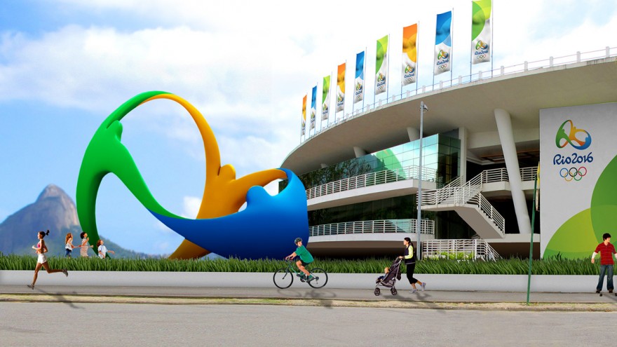
Award-winning Brazilian designer Fred Gelli says passion and transformation were the foundations from which the Rio 2016 Olympic emblem was born. His design firm, Tátil Design, are known for their sustainable designs and this time, they sought to express the extraordinary nature of the Brazilian people in the logos for the Olympic and Paralympic games.
According to the firm, human warmth, acceptance and sharing characterise the Olympic spirit. “We were born from a mixture of ethnicities. We warmly embrace all ethnicities, faiths and generations. We share our sky, our ocean and our happiness with the world.”
The logo represents three figures, in the yellow, green, and blue of the Brazilian flag, joined at the arms and in a triple embrace. Always intent on the combination of business and nature in his designs, Gelli’s firm drew further inspiration from the natural beauty of the Brazilian landscape with the overall shape reflecting that of Sugarloaf Mountain. “Yellow symbolises the sun and our warm, vivacious and happy nature. Blue expresses the fluidity of the water that surrounds us and our easygoing way of life. Green represents our forests and hope, a positive vision that inspires us to go even further,” the studio adds.
Inspired by the people and the natural beauty of Brazil, the Olympic logo evokes unity. “It's a large collective network in motion, an invitation and inspiration to Rio and the world,” writes the firm.
The Rio firm designed the winning entry for the logo in a competition involving 139 agencies. The Olympic Games will take place from the 5th to the 21st August 2016.
For the Paralympic emblem, Tatil Design created the first multisensory brand in the history of the Paralympic Games. At the time of its launch in 2011, the firm said: “The goal was to create a brand that could inspire people as much as a Paralympic athlete does through determination and ability to overcome. It is a symbol that reflects not what sets us apart, but what makes us equal, a beating heart with endless energy.”
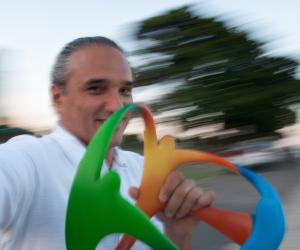
Gelli, the firm’s creative director and partner, has won over 80 national and international awards, including the IF Design, IDEA –USA, D&AD, Cannes Lions, Caboré, and the REBRAND 100 Global Awards.
Fred Gelli will take to the Design Indaba stage at the 2016 Conference to give some insight into what makes his firm one of the top branding agencies in South America. Book now.

