Nendo takes inspiration from European parks for the interior redesign of a department store in Tokyo.
Japanese design studio Nendo has extended their work with Seibu department store with an interior redesigned of the women’s clothing floor.
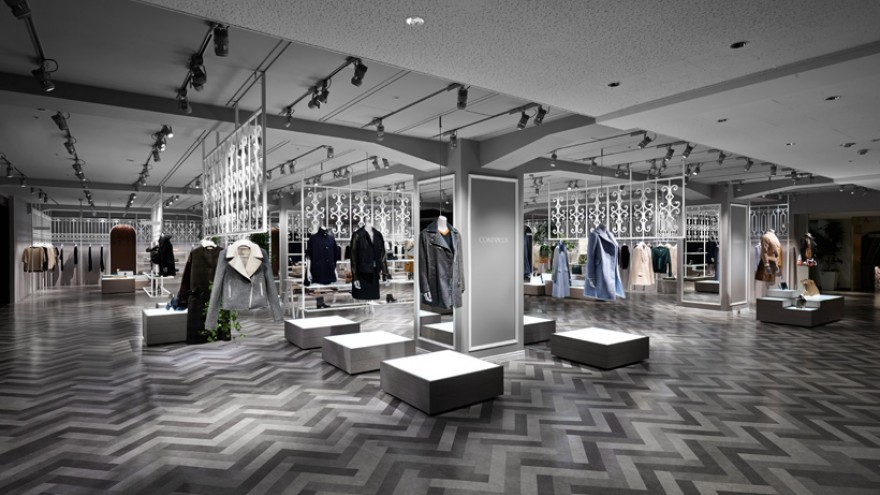
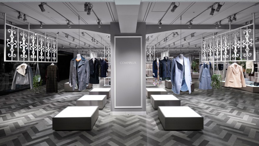
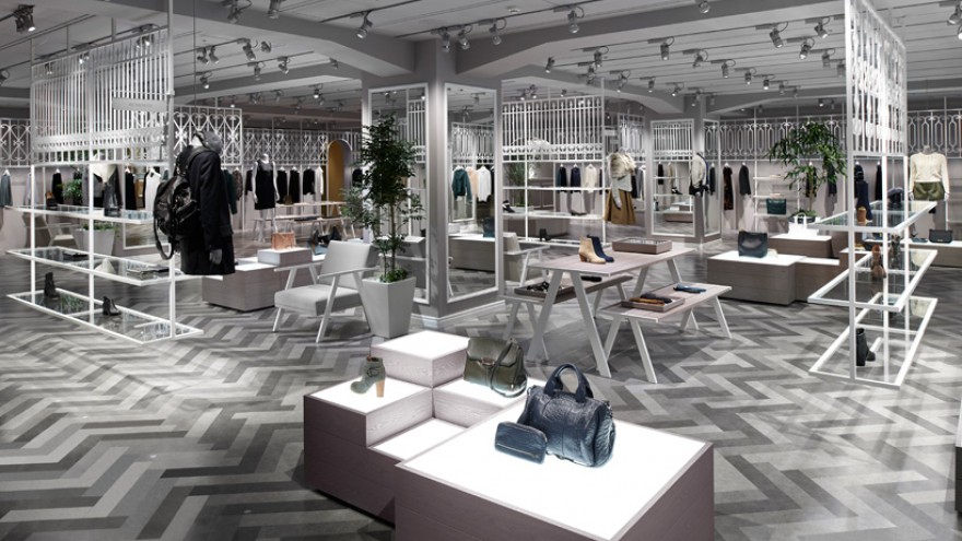
With a “contemporary luxury” aesthetic, the newly designed interior presents multiple brands together in a unified environment, while ensuring each brand is gently distinguished from others.
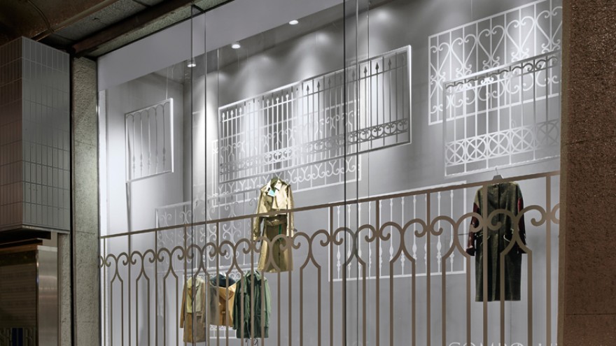
Our design took inspiration from the wrought iron fences surrounding the parks, squares and other green spaces in European cities, says Nendo founder, Oki Sato.
The studio created screens that resemble these fences and suspended them from the ceiling to function as unique racks for hanging all of the different garments.
The screens are easy to remove and relocate, and have built-in lighting to illuminate the clothes. They come in seven different patterns, to give each brand a distinctive look.
Nendo also redesigned the floor by cutting ordinary plastic floor tiles into different shapes and created a variegated flooring pattern that recalls cobblestones. The colourful changing room walls are finished with artificial ivy in different hues.


