From the Series
Designers all know that the style of a font influences readers’ perception but few have concrete data to back this up. Errol Morris, filmmaker behind the award-winning documentaries “The Thin Blue Line” and "Fog of War," conducted his research in the form of a social experiment disguised as a quiz on The New York Times’ website.
The online quiz, conducted in 2013, was a test to separate the optimists from the pessimists, and invited Times readers to agree or disagree with the line, “we live in an era of unprecedented safety”. But the fact that 61 per cent of the readers were optimists had little meaning for Morris, whose actual intention was to examine how “typography shapes the way we see the truth”.
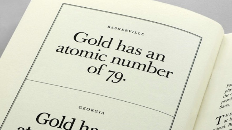
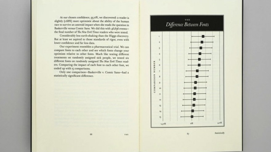
The quiz was published in six arbitrarily assigned typefaces – Baskerville, Computer Modern, Georgia, Helvetica, Comic Sans and Trebuchet – which categorised the readers’ responses. Morris found that Baskerville provoked the most optimistic responses – a sign that the typeface made the statement more believable.
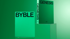
Morris revealed his findings in a two-part essay published in – naturally – the Times and has now repulished it in a book designed by Pentagram’s Michael Bierut and Jessica Svendsen.
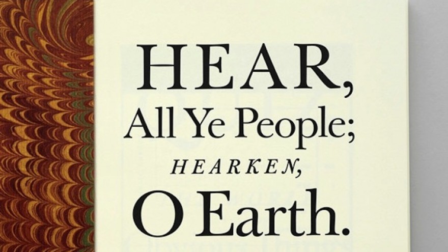
Hear, All Ye People; Hearken, O Earth has been published as the 44th edition of the Pentagram Papers, a monograph that the design firm sends to an exclusive list of individuals each year.
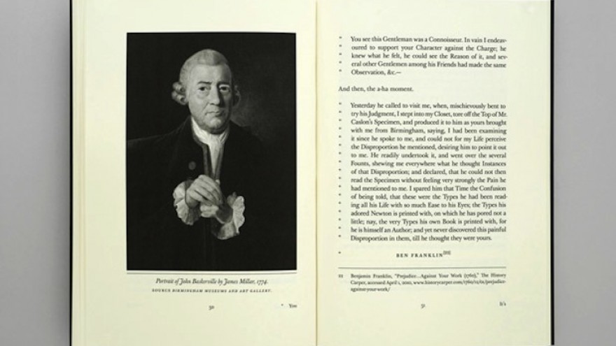
In his essay, Morris traces the typeface’s origin to John Baskerville and his incessant pursuit to master the art of “letter-founding”. In fact the title of the book, a playful reference to the important announcements made by 19th-century town criers, is extracted from a Baskerville-printed edition of the Holy Bible. The author even owned up to making the conversion from Bembo to Baskerville, when writing his own manuscripts.
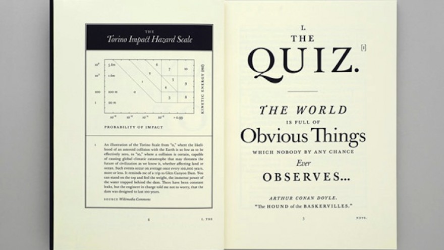
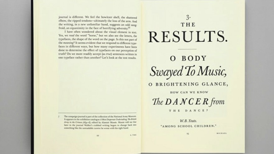
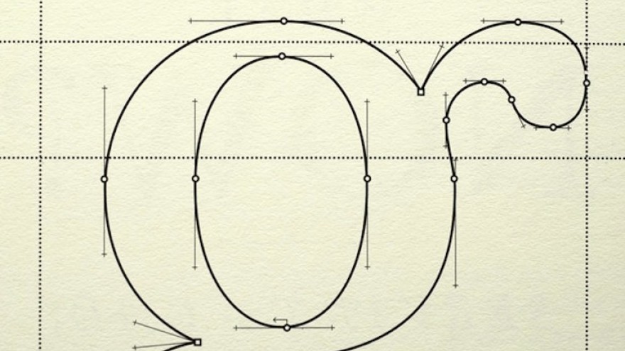
Bierut and Svendsen have designed infographics, diagrams and historic visuals that trace the story of Baskerville, the man and the font.

