From the Series
Capturing the vibrancy of the Luminato Festival, Michael Bierut designed a colourful identity for one of the biggest arts festivals in North America.
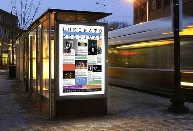
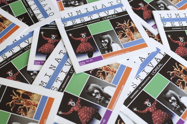
Working closely with Luminato artistic director Jorn Weisbrodt, among others, Michael Bierut and Hamish Smyth highlighted the festival's celebration of music, theatre, dance, visual arts, literature and film through a scheme of bright and bold colours.
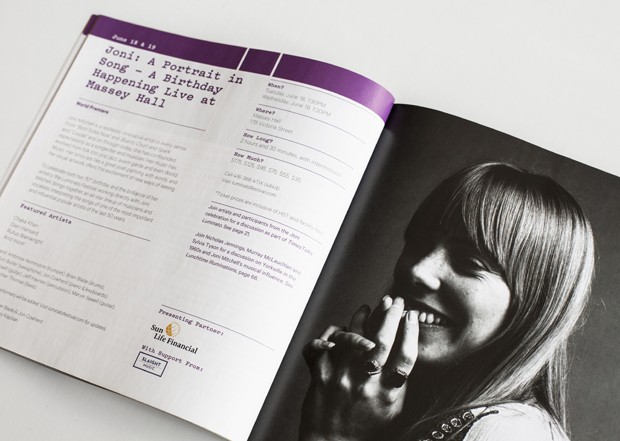
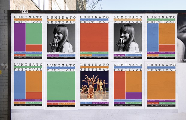
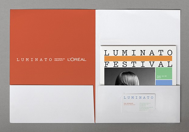
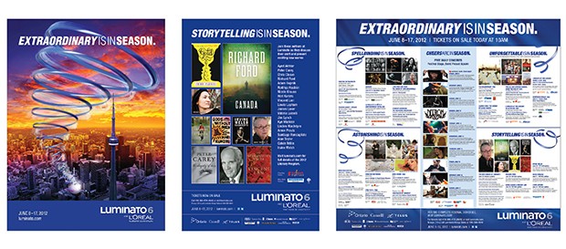
For the identity the designers created a system that used a flexible grid, bright colour palette, and two new typefaces, Pitch and Calibre, to unify all materials created for the festival. The programme highlighted the actual events as opposed to metaphors or promotional themes.
Colourful patterns altered with images of performers and artists, and the grid acted as a framework that let festival stars such as Marina Abramović take centre stage.
The new design establishes a cohesive, focused system that allows the incredible variety of Luminato’s offerings to shine through, comments Pentagram.
Bierut and Smyth further formalised the name of the event as the Luminato Festival, and found a way to more clearly state the relationship between Luminato and L’Oreal, pairing the names in a graphic element that appeared as a logo on all programmes and posters.
The Luminato Festival took place in Toronto earlier this year, and highlighted the city as a cultural capital.

