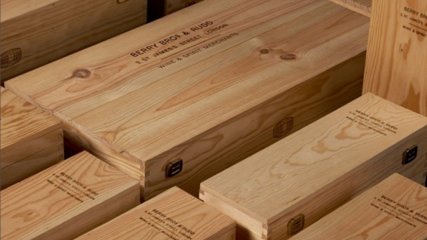
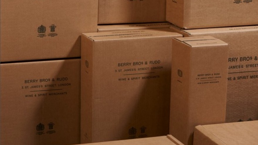
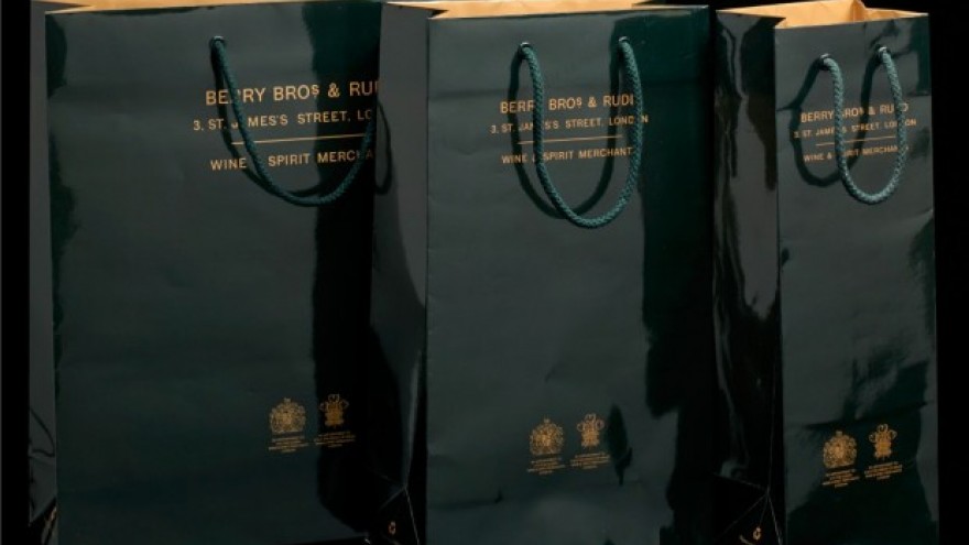
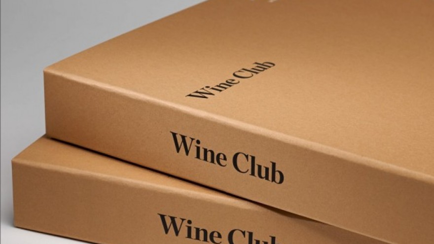
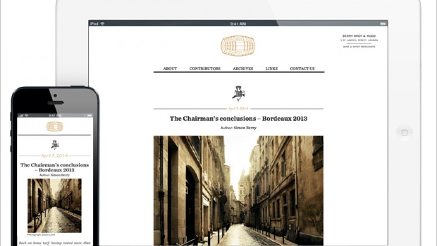
Pentagram partner Harry Pearce has created a new visual identity for Berry Bros. & Rudd, the world’s oldest wine merchant.
Creating a modern, robust identity for the world’s most respected wine merchants Berry Bros. & Rudd proved to be quite a challenge for graphic designer Pearce, as he needed to establish a direct link between the makers and the drinkers of wine. The new visual identity further has to feel as though it has always existed as part of the wine merchant’s history.
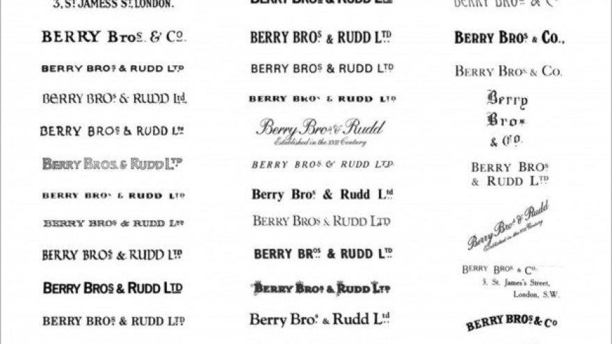
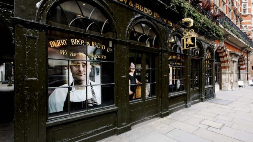
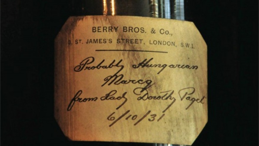
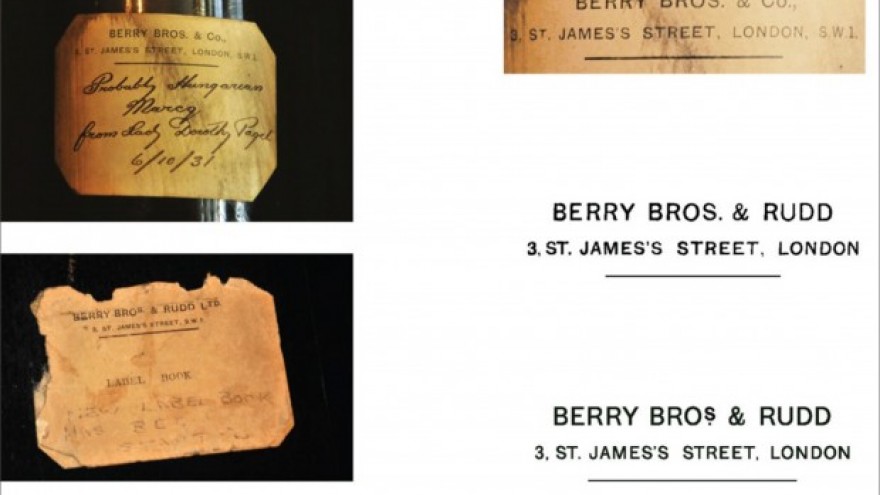
In order to uncover lost stories and reference the company’s history and authenticity, Pearce sourced the grounds of the wine merchant original home in London, researching and photographing a host of branded artefacts spanning some three centuries. Through studying wine labels, walls and old publications, Pearce discovered a great array of typographic styles.
I spent days simply being with the history of this extraordinary company. In its cellars, archives and warehouses, relentlessly photographing and soaking up its spirit, says Pearce.
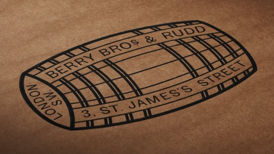
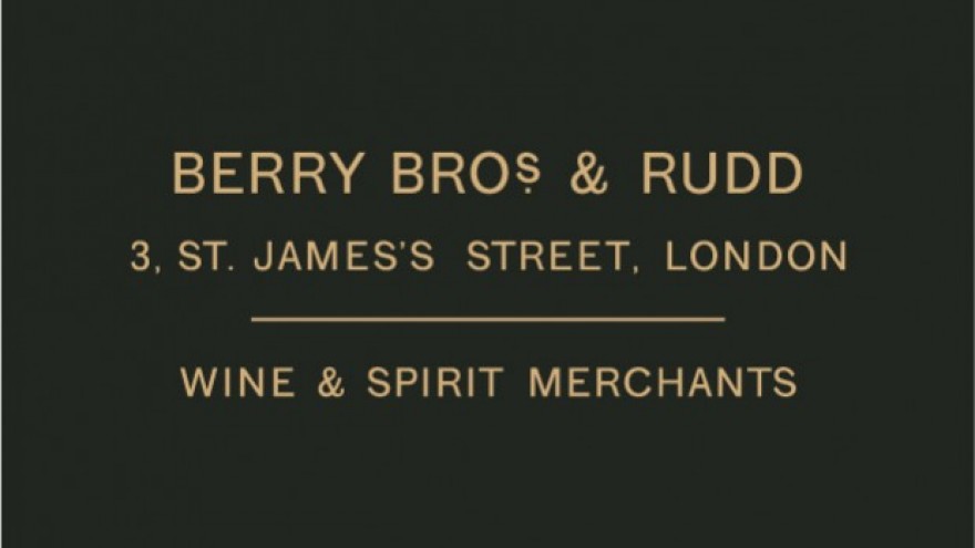
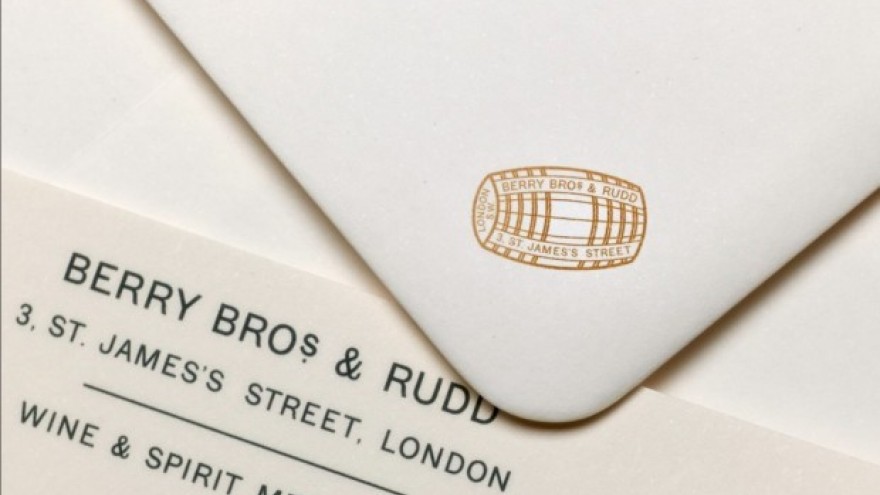
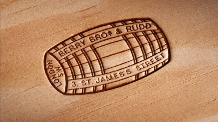
For the visual identity, Pearce designed a new logotype inspired by the blend of typography and charming handwritten notes he discovered. He further relooked the symbols and colours of the company in a fresh way, opting for corporate green, cool greys and gold lettering.
So substantial is the story behind Berry Bros. & Rudd that nothing needs dressing or fabricating, just retelling in the most candid and honest manner. The final identity is a respectful returning of wonderful things, lost in the past, reborn as a platform for an ambitious future. The hand of the designer is almost invisible, invention would have been useless, says Pearce.

