


First Published in

The first idea
While South African people have optimistically embraced the new age of cultural and social integration, South African brands have become casualties of rapid organic growth, causing fragmentation and confusion about the overall promise that South Africa offers as a destination.
Multi-disciplinary brand consultancy, Switch Group, together with the other agencies briefed, formulated a brand platform to work from, out of which the concept of "Real Freedom" transpired. The essence of this freedom is based on the country's national heritage, the opportunities that the future holds, and its geographic spaces.
Brazil's brand identity was an inspiration for the Switch Design team in that it captured the spirit of the country in a celebratory identity and tagline, 'Sensational', presenting best practice within the developing country category. "This was an insightful thought-starter for us," says Gaby de Abreu, group creative director for Switch Design.
"Our first idea is based on the name 'South Africa' that already boasts valuable brand equity and strong emotion internationally. Through the smart use of typography, the Switch creative team demonstrated fusion and diversity, by combining the lettering of the country's name, using colour and split quadrants. Metaphorically, this image represents South Africa's resourcefulness through the merging of letters A and F and also i and C, without compromising the legibility. The down-to-earth, rustic approach is simple, but reveals a sense of consolidation and multiplicity." says de Abreu.
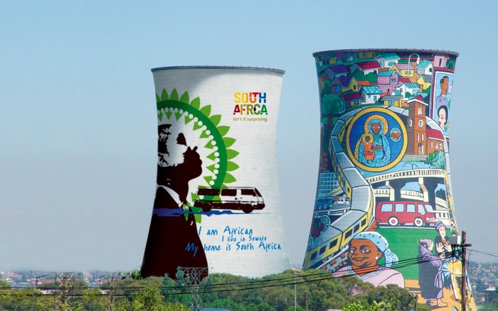
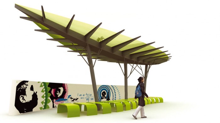
A collage of visuals representing provincial imagery was developed into wallpaper, illustrating fusion of the country's brand promise.
To further enhance the element of surprise, we experimented with a collage of images featuring recognisable South African icons, that were used as a visual language to support the brand identity.
This visual language was flexible enough to be used as large areas of wallpaper or cropped to focus on specific icons to communicate a message.
According to de Abreu, "we wanted to create an original perspective that best represents the nation of cultural richness, energy and opportunity across all races, age groups and genders. The variety of appeal that SA offers could be described as a world in one country and we decided to use the emotion associated with this appeal to develop a visual interpretation of real freedom. SA is already considered a top experiential destination that offers travelers something unique and something of a surprise."
UN secretary general Kofi Annan supports this sentiment and was quoted saying, "South Africa is a country in which one can expect the unexpected. An inspiration for all. What made it possible was the determination of the people of South Africa to work together, to transform bitter experiences into the binding glue of a rainbow nation."
The element of the unexpected or surprise that the country assures visitors of was channeled through two thoughts, 'fusion' and 'diversity', and two textured brand images emerged.
The second idea
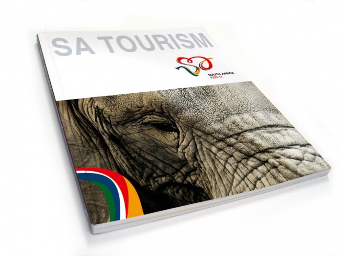
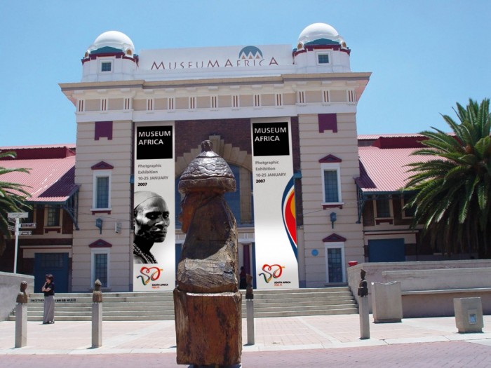
The identity was designed by fusing the abbreviated version of the name South Africa, i.e. SA, and the colours of the country's flag. The relaxed lettering was drawn in a free-flowing swirl that encompasses the personality of our nation and how it knows no boundaries. The movement captured in the logo illustrates free-flowing freedom and creates a subtle heart shape in the middle.
We played with the swirl and stretched it out to become a flowing ribbon, to be used in conjunction with the heart shaped logo on all visual roll-out. The extension of this identity allows a visual language to be developed, and at the same time aids brand recognition. South Africans will only have to see part of the ribbon to immediately recognise the brand, and feel connected to it and what it stands for.
Talented local photographers captured beautiful images that are distinctively South African, for use in promotional brand applications. Using images that evoke freedom will attract the attention of foreign visitors and create synergy with the total brand experience. The usage of these visuals in conjunction with the ribbon demonstrates that everything we touch enhances a connection between us, the brand, and the country… A total brand experience.
Visually, the wave will be extended and applied to all elements that touch South African lives. It has the potential to add colour, life and emotion to any application and not necessarily in its full form. The beauty of this creative is its flexibility and the power of its expression. If only part of the wave is seen, it still offers the same visual nuance.
Both ideas were opened up to vigourous debate within the agency. This provided an opportunity to ensure that the visuals spoke to all cultures, genders and age groups etc. "It's important to speak the same language across the different groups," says de Abreu.
The colourful wave will be subtle, but should evoke feelings of freedom and patriotism as it meanders across city buildings and national sites.
Switch Design anchored its creativity on tactile human emotion to define a personality for the country and its worth. "We believe that both ideas embrace the true meaning of 'Real Freedom' and simply illustrate the promise South Africa guarantees its visitors. These designs could only have transpired from our acknowledgement of everything South Africa stands for as well as our passion for this extraordinary destination," concludes de Abreu.
Let's keep at it!
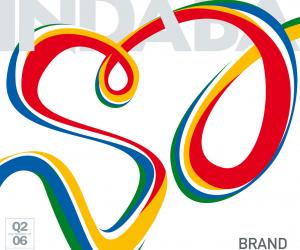
Design Indaba commissioned three top agencies to apply their skills to the uber brand, South Africa, because we believe that there is a gap between our country's image and reputation, and the realities of its amazing achievements since democracy. Here's what switch, two tone and hklm have come up with to help close that gap.