From the Series
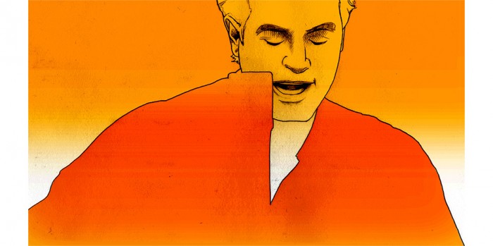
Wesley Stace has been one of my favorite artists for over 20 years. I first heard him on the dearly departed KSCA 101.9 in Los Angeles when he still went by his stage name John Wesley Harding, and again shortly thereafter on the High Fidelity soundtrack. We had a chance to speak after one of his concerts, and I told him that I’d love to do some animation for him should he ever have need. To my great surprise and delight, he said “Yes! As a matter of fact, I need animation right now!”
Wesley was touring in support of his excellent new album Self-Titled and was working on the accompanying videos. Director Matt Grady — with camera men Adam Ginsberg, Ryan Balas, and Jorge Torres-Torres — had filmed the band performing six of the songs in the studio. Now they needed extra material to edit into those performances to have a distinct look for each piece.
I’d originally fallen in love with Wes’s music for his sharp and often funny lyrics, as well as for his quick and self-effacing banter between songs. When I offered him an animation, I had thought of singing Daily Monsters. He rightly felt, though, that they weren’t a good match for the more personal and wistful songs on his new album — the first he’d released without the armour of his pseudonym.
Around this time, I was at the tail-end of taking a few months off from work. After having improvised a lot of animation for the Monsters using a programme called Anime Studio, I wanted to teach myself at least some aspects of “proper” animation. I’d begun fiddling with a little sequence where my own head would turn into that of a monster.
I filmed myself in the mirror, going from a placid look into a wild whiplashing spasm.
I started the animation by tracing my head on transparent paper — a homemade version of rotoscoping — and then morphed myself into monstrous shapes. A lot of the initial pencil work happened while I was on jury duty. You can see the original demo below, and you’ll understand why I got some strange looks from the people around me in the waiting room at court.
This is the piece that I showed Wes. For me, it would be an homage to the classic 80s video for the band A-Ha, directed by Steve Barron. It was one of the videos that made me want to become an artist. I asked Wes, “Don’t you want… don’t you deserve… to have your own version of ‘Take On Me’?” “On any level!” he replied, “I should think it’s every singer’s dream come true!” And we were off to the races!
We talked about different concepts for different songs, but settled on “Goodbye Jane” and on the very simple idea of the images getting darker and darker towards the end, when they’d be obscured by an ever denser field of pencil lines to show the character vanishing inside his own memories. With this I went to work.
Based on a few quick tests, I’d settled on ten frames per second instead of the 12 that are usually considered the absolute minimum for animation. (By comparison, the classic Warner Bros cartoons had 24 frames per second, Pixar has 30.) I liked the languid, dream-like feeling that fewer frames created — images arising and vanishing in a memory, just as they do in the lyrics of the song.

The original plan was that we’d leave the verses as live action footage and fade over into animation for the choruses, but when Wes saw the first 10 seconds he smartly played on my vanity. “Wouldn’t it be great if the whole thing was all your animation?” Yes. True. Obviously. How could I argue, when he was so clearly correct?
Of course, that pushed the frame count from maybe 400 frames to 1 810. But again… vanity.
I began by making printouts of the original studio footage. One frame per sheet. I’d slip each one underneath a piece of vellum paper and started tracing. The trick was to figure out the minimum amount of detail to bring the performance alive on paper. Too few lines, and the animation becomes too abstract to make sense. Too many lines, and faces start looking wrinkled, and everything vibrates from frame to frame. A little vibration in the lines is the great appeal of this method, but too much would be frantic.

Motivated in equal parts by artistic vision and base expedience I decided to omit all detail from the bodies. Just for starters, a Martin guitar has six strings and 20 frets. And a bridge. And a hole. Even if the guitar only shows up in half the frames, that’s 25 200 extra things to draw. 25 200 chances to forget a part, or make it go squiggly. Besides, leaving out all those details really does look great! It focuses the eye on the faces. And I love how the guitar melts in and out of the silhouette of the body. It gives you a lot of information on the shape of the instrument. Back in college, the great Norm Schureman always pushed us to edit our drawings — to put in detail only where it was needed, and to describe the rest of the subject with as few lines as possible. It’s our job to guide the eye.

My original plan was to draw 100 frames a day, which would mean about three weeks of pencil work, another few days of scanning and putting the frames in order in After Effects, maybe two days of colour work, and I’d be done in a month. Seemed totally reasonable, and of course it had no basis in reality whatsoever.
As it was, I averaged about 20 frames a day. Some days I managed up to 60 frames, other days I was lucky to make it to ten. Cables and tuning pegs take time, and as much as I’m a disciplined worker, my brain simply couldn’t handle more than a few hours of tracing each day.
I wanted a Zen project, but as it turns out, I’m no monk. The tedium becomes a physical force.
To get through the whole lot took three and a half months. The resulting stack of tracing paper weighed 12 pounds.

The scanning process actually went pretty smoothly. I whipped through it in a week. I oriented the scans by tracing two big registration marks printed along the top of the original footage printouts. Same method I’d been using since I was 15. Low tech, but effective. Proper animators use registration pegs, which makes a lot of sense and would’ve helped me in a number of ways later on, but sometimes enthusiasm wins out over diligent advance planning.
Early on I’d noticed something that had escaped me when looking at the original footage. The video had been shot with a handheld camera for a documentary feel. This looked great within the full studio environment, but of course I’d decided to show Wes, his lead guitarist David Nagler, and bassist Eddie Carlson stripped of their surroundings. In this minimalist set-up, free of all spatial context, the handheld camera shake made it look as if I was drunk at the scanner.
When this dawned on me I was 100 frames into the project, and I had no solution. I had a vague hope that the shake would look cool once it played out over three minutes, but I was pretty sure it wouldn’t. The sensible move would have been to re-asses, to stabilise the live-action footage, and start over on the trace. The ideal move would’ve been to reshoot the whole thing with a tripod. On a white background. Without anybody being artfully blurred. But that’s loser talk. I’d muscle through.
My true worry was that I’d not find a workable solution straight away, and that I’d throw in the towel. Instead, I doubled down and decided to trace the entire piece as it was. This way I’d be so invested that I’d have to find a solution later on. You don’t walk away from almost 2 000 drawings.
In the end, the solution was to stabilise the traced frames in After Effects, which involved going through the shots and manually defining two points in each frame that were stable relative to each other — the top and bottom of a microphone stand, for example. The farther apart those two points are, the better, because there is more tolerance for being a few pixels off in the marking process. The application would then rotate the frames to always keep those two points in the same position relative to each other.
![]()
As it turns out, this would have been infinitely easier had I done it in the live-action footage, what with its sharp edges. Squiggly pencil lines really keep everything a bit looser than one would hope. After the initial pass, I went through a few more times to make adjustments. Yes, that was another month of work, but nobody likes an unsanctioned shoulder shimmy.
One unhappy side-effect of rotating the drawings to stabilize them is that many now had detail that fell outside the frame and areas where there was no more drawing to show. Some of those instances I could fix by zooming in, others required going back to the original drawings and adding things.

While working on all of this I began to notice that I didn’t like some of the edits between shots. Wes would jump from one end of the frame to the other, for example. Other times we’d go from a now static setup to a tracking shot. Both had worked well in the original edit by Rachael Fiorentino, but felt jarring without the context of the studio environment and the unifying element of camera shake. So I added a few of my own camera moves in After Effects.
Lastly, there were one or two shots that cut on the beat of the song, but left Wes with his mouth open in mid-sound. Again, no problem in the original footage, yet not quite graceful in my version. It bugged me.
I had to create a few extra frames for which I had no original footage, so I carefully frankensteined suitable faces, bodies and guitar strums.
Could I have asked for additional frames from the original footage? Frames that certainly exist and would’ve been easily retrieved? Of course, but by this point I was propelled by a mixture of obsessive-compulsive madness and embarrassment for not planning the whole thing out better from the get-go. Every action now started with “Well, shit. Hm. OK, let me just… .” And the weeks were drifting by.

Part of the joy of a project like this is figuring things out on the fly, and building elaborate workarounds. Of course, there would have been much more efficient ways of doing all these things, but the whole point is that I know that now.
The one thing I knew would be a breeze was adding colour. I’d designed the frames to be easy to mask. I’d tested this on my own transformation from man into monster. Of course, I’m bald. And I wasn’t holding a guitar with fiddly little tuning pegs. These things really, really confused the otherwise near-magical After Effects Roto Brush tool. It didn’t much care for my ten frames per second, either — too much of a jump from frame to frame. All of this called for tons of little manual adjustments, each of which the programme would then helpfully propagate across adjoining frames whether I wanted it to or not. Several times I finished a few hours of work only to realise that other parts of the mask had been utterly corrupted. When I finally had things just about right, I rendered a flat version of the video, and fixed the last bits by using a cloning brush.

Aesthetically, I had started with the idea of keeping the skin and hair white, making the rest of the silhouette a solid black, and placing the whole thing on a solid colour background. Maybe the background colour would change through the video, but I certainly had something very minimal in mind. Once I saw the assembled pencil drawings in motion that seemed way too heavy-handed, so I started playing around. With every project there are dead spots where I can’t quite figure out what the shape of the whole will be. Those are unpleasant if not downright scary days, particularly on a very involved project like this. That’s where discipline and experience come in. At this point I know that an impasse won’t last, and that I just have to muscle on.
The somewhat delicate art demanded a light touch. Smothering everything in a heavy Béarnaise would’ve ruined the dish. I couldn’t figure it out for quite a while, but when I hit on the orange gradation into white I started getting excited. From there I just let the song guide me. I’d made the decision to just let the performance stand on its own — instead of cutting away to conceptual images, for example — but I wanted the colour to help tell the story that was already evident in Wes’s face and motion. Things start out with a sunrise, storm clouds appear, night falls, and in the end it all fades away. (This is why I don’t write the lyrics.)

All along the way I had kept the colours on separate layers from the drawing. I wanted to be able to remove dust from the scans without affecting anything else. That whole process happened on a parallel track. Unfortunately, each time I updated a newer, cleaner version of the drawings Roto Brush decided to recalculate the masks, creating endless little areas of havoc. It took me a few weeks just to figure out that this was actually happening. Until then I just thought I was losing my mind. By the time the penny dropped the drawings seemed pretty dust-free, so baking the line art and colours into one solid piece of footage seemed wise.
No… I know… Of course it wasn’t wise. There was so much dust left! So much.
Each clean-up pass allowed me to notice another level of little dancing dots, and led to two more weeks of removing over 20 000 individual grains of dust one by one.
I know that figure, because After Effects automatically assigns a number to each correction. I always thought I had a clean scanner. I don’t. Filthy. Filthy, filthy scanner. Still not clean. Never clean. Especially if you turn down the Gamma on your monitor to take a better look. Never turn down the gamma on your monitor. It’s horrible.

And through all of this, Wes hadn’t seen anything beyond the initial 100 frames. Which he’d liked. But he had also been concerned that some of the drawings didn’t actually look like him. Which they didn’t. He was right. I’d noticed the same thing. So this was a concern. A big part of the project for me was learning to draw better likenesses. I’ve always felt self-conscious about not being able to draw solid portraits.
It’s part of what motivated the designs I did for Jason Bentley and John McCarty years ago, as well as this (sadly rejected) flyer for Ben Watt.

I figured that I’d get more skilled as the video went on, and that a better likeness emerging over time would be a cool part of the video — the singer becomes more himself as time goes on and he knows himself better. Ex post facto rationalisations are a crucial part of the creative process.
Still, I was sweating bullets. With any regular project, I’d show work in progress along the way to make sure everything is coming together as it should. In this case there were so many parts I hadn’t quite figured out yet that the “in progress” versions just looked dispiriting to me. I thought that showing the video in that state — especially after having taken so much more time than anticipated — would’ve killed everybody’s enthusiasm. So I waited to get everything right, and my client was kind enough to let me. I gambled. Getting the enthusiastic thumbs up from Wes was a serious relief and a genuine delight.
In the process of making this video, I listened to “Goodbye Jane” hundreds of times, and I still love it. That’s the mark of a great song. I hope you’ll enjoy it, too. In fact, you should download the whole album on iTunes or buy it on Amazon.
Most of the time, jobs have tight deadlines and demand a clearly predictable outcome. It’s a rare luxury that I get to take this much time to play around and learn new things in the pursuit of something that’s unknown to me until it’s done. The fact that I got to do it for an artist I admire makes it that much more enjoyable.

Watch the finished piece here:

