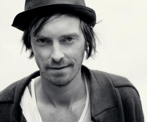
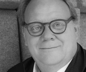
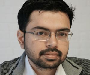
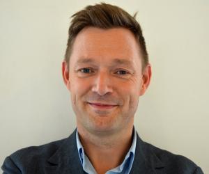
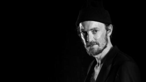
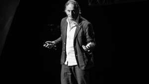
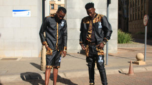
At Design Indaba 2014, Danish design was represented by a delegation that consisted of Nille Juul-Sørensen of the Danish Design Centre, Vinay Venkatraman of Leapcraft, Mikal Hallstrup of Designit and Henrik Vibskov of Henrik Vibskov.
Designing with meaning
Nille Juul-Sørensen begins the panel discussion with the statement: “Lets rock 'n’ roll. Danish Design is so much more than a chair.”
He jests that Danish design is best known for seating. And when the chairs designed lose popularity, the designer simply changes the colour.
Juul-Sørensen was a partner in the largest Scandinavian architectural office, KHR Architects, for 10 years, where he was responsible for architecture and design of the existing Metro followed by the design of the upcoming Cityringen for Arup.
“We should start designing for the 99 percent of people, not for the one percent.
Lets not design chairs, there’s enough of them. No more white coffee cups. For the next 10 years, let’s design something that gives meaning to people’s lives."
Looking to the future, he is motivated by the desire to avoid waste by designing systems and not simply gadgets.
He proposes a circular economy to do this: we make products, consume them and then upscale them to return the product back into the system. Then repeat.
“We as designers should start pulling our socks up to do some design that gives meaning to people. Design that we can engage in by asking the right questions so that it gives meaning to people.”
Juul-Sørensen imagines design as a democratic tool for all people to imagine the future. He compels the audience to reimagine South Africa through design that engages.
Designing with data
Vinay Venkatraman runs a design and innovation company in Copenhagen. His team consists mostly of non-designers coming together and blending itself into a creative system.
Of the future of design, Venkatraman says: “I have a small hypothesis that the raw material is invisible, it’s not tangible, it’s not something you can hold in your hands but it’s something we feel everyday and that is the story of data.”
There is definitely something really intriguing about thinking about data as a raw material. It changes the perspective, it gives you a new lens to look at how to approach problem solving, opportunity seeking and creating new systems and solutions.
While Venkatraman uses data-related jargon, he makes an incredibly compelling case for the role of data as a tool for designing solutions for the future. “Data is an interesting currency; it can actually change people’s lives and touch societies.”
Venkatraman is using simple, low-cost technologies to make the data revolution come to life in emerging countries. He uses the example of ASHA workers in India: the workers are “amazing foot soldiers who go door-to-door in villages and are at the front line of healthcare in India,” he says.
They are not trained as healthcare professionals but play the vital role of being the link between healthcare services and the families they serve. They especially focus on maternal health, tuberculosis and chronic illness.
Venkatraman employs data to empower the ASHA worker because the Indian health system is suffering from an understaffing problem; Venkatraman estimates a 200:2 patient: doctor ratio in some remote villages.
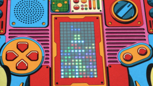
The project gives the ASHA workers digital solutions to better screen patients in a low cost decision making support system. For example, they used a mass produced alarm clock and modified it to tell more than time. They made a medical screening tool by implanting sensors and a microcontroller written with software.
The modified clock has a simple triage model: red for danger, amber for nearly in danger and green for full health. The clock covers a number of sensors: pulse rate, blood pressure, and respiration rate, body temperature and oxygen saturation. The ASHA workers use the clock to make decisions about the extent of a patient’s illness, and then refer the patient to a clinic if needs be.
“My take on design is that it has moved beyond the artefact and service offering; it’s an approach to creating holistic experiences and coping with systemic complexity,” he says.
Designing with warmth
Mikal Hallstrup is the co-founder and chief visionary officer at Designit. One of the world’s largest design and innovation companies, Designit helps its clients across numerous sectors to understand the future of products and services in the digital age.
Hallstrup begins his talk with his company’s advert. The tag reads: “We are Designit. It can be everything.” They look for the junction between human desire, technology and business.
“We’ve learnt that products don’t die. But they are increasingly turning digital. We’ve learnt that the challenge is not the product as such or its usability but rather how it merges into larger systems.”
I don’t know what it is about this planet, he says, but we have this ability to design things so thoroughly that we kind of mess it up.
Hallstrup approaches design by trying to convince the industry involved that the fastest way to go from a need or a challenge to a solution that works is by “spanning the bow”, or rethinking things – using design to bridge the gap between thinking and doing.
For the Oslo University hospital they followed the very simple design brief to give breast cancer patients a better hospital experience. They began to pilot a project called the New Breast Cancer Diagnostic Centre.
Hallstrup’s projects approach patient care and experience with “warm hands” – where the hospital administation had previously been good at procedure but had poor bedside manner.
The pilot project managed to decrease the waiting time for diagnoses from 12 weeks to four days, creating a 90 percent improvement.
Hallstrup’s designs helped Oslo University Hospital to fulfil its service promise of “caring healthcare for patients”. The second promise was refocusing the healthcare around the patient and the third was making the patient an expert in his or her own healthcare.
Designing with mistakes
The last speaker on the panel, Hendrik Vibskov, remained sitting on the bench rather than standing – not because he wanted to retain a cool persona but because he really needed the bathroom.
Vibskov is a fashion designer working with textiles who exhibits shows and installations frequently. Speaking on the backend of the panel Vibskov light-heartedly says, “I’m afraid of calling myself a designer because I’m not doing any hospital projects. My work is more artist maybe, I do the fashion thing.”
In a previous interview with Design Indaba, Vibskov is quoted as saying his design philosophy is “don’t sit on the back wheel and do try to move forward.”
He challenges himself as a fashion designer; he doesn’t want to bother with small questions like whether to sew three or four buttons onto a cardigan. His work goes beyond designing garments to create mesmerising spectacles, and in each of his collections he challenges our everyday understanding of clothing and its relationship to the world around us.
Between designing new collections biannually and “creating the universes surrounding them”, Vibskov kept himself occupied as a drummer, where he began to take an interest in fashion.
Clothing is maybe still one of the fastest communicators, he says. We send codes and signals, perform and send off certain appearances to people.
He toured South Africa and realised that despite the endemic socio-economic problems, all people still value good appearance.
Vibskov is not a fan of perfection. “Mistakes are really important for the human mind to be creative,” he says. “Mistakes and faults yield a better perspective and 'genius elements'."
The slides behind Vibskov show an array of his projects which don’t strictly adhere to pure fashion design; they border on art and installation. There is a dinner table with guests seated on the runway where models walk in his designs. A drumming machine, also installed on a runway, emitted acoustic and electronic sounds triggered by the models’ footsteps.
Still needing the bathroom, Vibskov gets up towards the end to show a collection of menswear he’d designed and an installation piece he had made. The menswear was a collection of skirts he’d previously designed for women and the installation was a research project into the colour mint.
“How does mint music sound, how does mint food taste, is there mint structure, could we do a mint dance, could we create a blown-up mint structure?”

