


First Published in


The early 1990s saw the South African wine industry undergo a radical restructuring of activities. Political transformation enabled a return to the international market, and red wine was enjoying a boom because of its newly discovered health-giving properties. At the time, however, South African vineyards were very much skewed towards producing white-wine varieties.
This was largely because the former apartheid government had given white farmers favoured treatment. KWV was a parastatal set up in 1918 to provide minimum wine-price support and statutory surplus removal. Farmers started producing bulk wine because, thanks to the KWV, they were guaranteed disposal of their product. Vast quantities of high-bearing white varieties such as Colombar and Chenin Blanc were planted, with these generally ending up as brandy spirits and grape juice concentrate, which the KWV was obligated to dispose of. Farmers felt free to cultivate tonnage without assuming responsibility for marketing their harvest.
After the ANC came into power in 1994, KWV undertook to transform itself from a national co-operative into a company and began a programme of complete deregulation. Suddenly, grape farmers had to adopt a more commercial attitude, something that has seen a huge change in the national vineyard. In 1990, for instance, 84% of local vineyards were planted to white grapes and only 16% to red. By 2002, white grapes had dropped to 61% of total area under vineyard, and red grapes had risen to 39%.
All this in an effort to bring the local industry in line with global trends. On the whole, South Africa has enjoyed success, with total wine exports rising from just under 22 million litres in 1992 to 218 million litres in 2002.
What's a moot point, however, is whether South Africa is successfully building a brand relative to competitors like Australia, Chile and Argentina. Is the South African wine industry meeting the challenge of conveying a compelling sense of self? Viewed collectively, does the standard of packaging of South African wines give the consumer good reason to buy? Consider the UK, by far SA's most important market. Here, approximately 90% of all wine is still sold at less than £5 (about R60) a bottle. The consumer can choose from a multitude of different wines, but typically invests no more than 40 seconds in making a choice. Until now, local producers have managed to deliver outstanding quality at low price points, but if they are to continue to capture market share, value for money alone is no longer enough. The packaging promise becomes key.
The consumer is looking for a brand that delivers some kind of experience. She (for most wine is increasingly sold through supermarkets, where customers tend to be female) cannot physically sample any of the wines before she purchases them, so a wine's packaging main function is to communicate its intrinsic properties in as engaging a manner as possible. There is concern that the true face of South African wine is not currently being conveyed. Take the category of motorcars as an example. When considering luxury German motorcars, whatever the marque in question, there's a sense of solid engineering, thoroughness, attention to detail. Italian motorcars, on the other hand, are associated with flair, beautiful design and emotion. Other than offering value for money, does South African wine possess any distinctive attributes? Arguably, the romance and heritage of a local industry that goes back some 350 years is not being successfully communicated.
Often, it seems, we're still too burdened by our own history to successfully harness it to define ourselves, and instead resort to drawing on outside references. Perhaps this is because South Africa was the pariah of the international community for so long that, upon being accepted back into the world community, local marketers have followed established trends rather than forged their own path. Opting for a borrowed solution, however, smacks of cultural cringe. It suggests that, as a nation, we feel so inferior about our own heritage that we're compelled to denounce it whenever we want to attract the international consumer.
On the other hand, it must also be stressed that labels that are overtly "African" are also hugely problematic. Design featuring Bushman drawings, Ndebele patterns, wildlife and the like are superficial and clichéd. They arise from trying to pander to an outsider's preconception of South Africa rather than using an authentic and original expression of the South African experience. The point is that most ethnic labels belittle the South African wine industry, reducing our wine to little more than some first-world tourist's holiday memento.
However rich and diverse South Africa's national identity, it's nonetheless difficult to stipulate how local designers should incorporate this into their wine packaging. There needs to be an awareness of how liquor packaging, and that of wine in particular, is governed by a subtle but definite visual language. Wine has a set of traditional values, and if experimentation is to take place, then it is within this set of values. The consumer has certain minimum expectations that the designer must deliver on.
The main function of a wine's packaging is to communicate its intrinsic properties in as engaging a manner as possible.
The best wine packaging tends to be classical, retaining all the traditional cues: the homestead, the vineyards, the region's defining character. The consumer must have an idea what a label stands for: if the winery is named after the Rooiberg, for instance, then the packaging should convey a definite idea concerning the mountain to the consumer. Simplicity and honesty are key.
The best French labels often look like a designer was never involved. At the same time, the rise of New World winemaking has seen a more innovative approach applied to wine packaging, which has helped demystify wine. For one thing, traditional names in languages other than English have been jettisoned in favour of names that have more universal appeal.
There are plenty of challenges as the South African wine industry seeks to adapt to international competition. If local wine is to develop a standing in the eyes of the world consumer, packaging with style and substance is a prerequisite. The challenge is to transcend established modes and genres, to create the kind of design a market research-driven approach could never deliver but that gives South African wines a truly distinctive edge. Our country is rich in different cultures. This should be all the inspiration we need.
So, how good are SA wine makers at managing their image?
Design Indaba Magazine asked our dapper writer, Christian Eedes for his opinion, before venturing out to Cape Town's Winex Show.
This is what he said:
The best packaging seems to be at the top-end of the market (wines around a R100 a bottle). Visit any boutique wine store and I am sure that you and the Design Indaba magazine team would be well qualified to make a selection. Three wineries that I think have particularly strong packaging are:
- Flagstone
- Lanzerac
- Meinert
Unfortunately, the worst packaging seems to be at the bottom end of the market, as if consumers who are looking for extra value for money don't deserve any extra effort when it comes to packaging. Visit your local supermarket and you will see that most wines around R20 a bottle, have atrocious packaging.
Furthermore, we asked the designers of this label for their rationales
Martin Meinert believes that the wine he creates is not all of his own doing. There are the elements, wind, water, earth, and sun that join together presenting him with the raw materials that he then crafts into wine. This process was what he wanted expressed in his label.
The symbol created for Synchronicity has its origins in the ancient art of weaving, a parrallel has been drawn between the art of making wine and the art of weaving, where the end product is influenced by the elements and only guided by man to achieve a unique result. When all these elements align in such a way that their synchronicity at that point creates a special product. Each weaver used different symbols to identify their particular cloth and all the symbols had a meaning, from wisdom to power. This personal mark is captured in Martin's handwritten label. The colours used are based earth tones, the soil that feeds the wine. Weaving in Africa is an ancient practice, traces of woven plant fibres date back thousands of years. Weaving is believed to have had a divine origin, introduced by Faro the Sun and Water God, who controls the cycle of seasons where nature marches to its own rhythm, an invisible order to which all life responds. This sence of continuity and change is reflected in the creation of Syncronicity which exudes its own artistic spontaneity when all the natural elements align. - Athol Moult, Design Art Associates
Then the team asked prominent South African designers for their comments.
Veejay Archary, design director, HerdBuoys McCann-Erickson
The promise of the international export markets brings an array of problems. Do we brand our (South African) product individually or do we stand a chance against the world collectively? Our local wine producers have their noses too far up their wine glasses to recognise that we have a better chance fighting the New World wines together than on our own. Yes it is all about 'da Dollar, but does it grow the industry, does it make the proverbial pie bigger or does it just make a few producers successful?
One cannot separate the product from the country of origin. Product and country go hand in hand, we have seen it work in the automotive industry, Mercedes, BMW (Germany), Hyundai (Korea), Toyota (Japan), in the liquor industry, Scotch (Scotland), Tequila (Mexico), Bourbon (America) as so on. Do any of the labels here work anywhere in the world?
YES! Can it come from any vineyard in the world? YES!
Does it differentiate South African wine from the countless others in the world? NO! Is there an opportunity here? DEFINITELY! And I don't mean stick a Proudly SA label on it or even a Ndebele pattern on it, but isn't that the challenge?
Garth Walker, designer, Orange Juice Design
Nice wine - pity about the label.
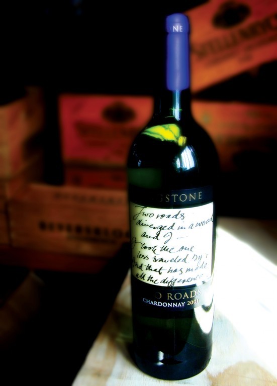
"Rated in the top three of best packaged wines..." Huh? Sorry, but I see nice design - safe design in fact. Handsome bottles and pretty graphics with handwritten type (to avoid sweating over proper typography). Nothing too edgy or "out there". Probably quite unlike the wines themselves, trying manfully to get out from behind the labels and take over the world.
I must say I'm somewhat surprised that these particular wines have been recognised. Having had firsthand experience of the Cape "wine label mafia", and of Cape winemakers themselves, none of this surprises me. I can only assume that the judges of "best packaged wines" are wine merchants and retailers. I sincerely hope these judges are not graphic designers - particularly not South African graphic designers.
I guess most of us creatives have long given up the struggle to design decent and challenging wine labels. The local wine industry seems obsessed with the "man from Sainsbury" buying five bazillion cases. Even if our wine labels pictured a dead bat - and the deal went through, they'd still be happy. Small "boutique" cellars do a far better job on their branding and labelling - but do not appear to have been recognised here.
Looking through the images supplied as examples, are wines with names that sound like engine oil additives. "Synchronicity" is not something I'd like to drink along with my rare roast beef. Devon Crest (looks like Deron?) has handwriting that, to me, looks like home-brew from the Milnerton flea market. Lanzerac manages to appear swish, though very safe and a tad boring. All very safe… I my view, we have far better examples of local wine packaging as examples of design excellence. I really think it's time the local wine industry got a grip on itself, and put a little energy and money into commissioning decent design. If ever there was an opportunity for local design to become a player on the world stage, wine labels are a way in. The field is wide open - even naff New Zealand manages to produce some really interesting wine packaging.
"Could do better" as my headmaster always used to say.
Sean Harrison, design director, CODE
I can't understand how these were voted the best but anyway, I like the Lanzerac packaging. I think it's production values are particularly high especially the quality of the APL (Applied Colour lettering - the gold foil applied directly onto the bottle). My feelings generally are that there are too many Labels from South Africa that look too similar. I think this is because there are studios that only do wine labels and the market consider them to be specialist, which we as designers know a 'specialist wine label designer' is a misnomer. The market use these 'specialists' and very rarely use anyone else - hence the similarity on our shelves.
I also feel there is a lack of good ideas on our shelves, good packaging around the world has great ideas. Generally I like packaging that has a sense of humanity - packs that do not patronise the consumer. Wine packs like Paddasvlei and Goats Do Roam are examples of this in my opinion, although I do not particularly like the graphics.
Jeremy Sampson, chief executive of Interbrand Sampson
The basic criteria for many things in design is to look good and do the job. In the case of packaging that job is to identify, sometimes protect and 'to sell' off the shelf. Remembering also that over 40% of shoppers take less than 5 seconds to make their buying decisions. So yes I can look at the labels from a purely aesthetic aspect and comment on the overall impression, the colour palette, the typography, the iconography etc.
But as a brander and a designer I have to ask about the brand: what are its values, its positioning, where is it sold and to who? Another consideration is that the positioning of some brands can vary by country. In South Africa to have a big celebration, provided you are pretty well heeled, could involve buying a bottle of non-vintage Moet & Chandon French champagne for around R350. The 'House of Moët' as a brand dates back to 1743. However, my memory of Moët is finishing a presentation mid-afternoon on a Saturday in Amsterdam, going into a sidewalk café and seeing a young couple who looked as if they could be art students ordering up one bowl of soup, a chunk of bread, a bottle of Moët and two glasses! Moët looks special and tastes special, every time, and is something for special occasions.
At the back of my mind is the fact that I think wine is a very weakly branded category as a whole - particularly in South Africa. Brands take time to build, demand a certain level of consistency, but need to stay relevant. Words and descriptors that may be fine in South Africa in that they are understood, distinctive and pronounceable may not work or simply be banned, internationally. We are no longer allowed to use words such as port and champagne. SFW for years suffered from the word 'winery' as internationally it is interpreted as being small, almost a family set up, and not a very serious business.
Handwritten labels to me tend to confirm this view and without referring to a graphologist it's hard to take the first two visuals seriously. My mother's hand written labels on her jams and preserves were far more exciting. From the hundreds of new offerings fighting for a share of my wallet it's difficult to treat this solution with any respect, and they certainly say nothing to me about wine. Lanzerac on the other hand has refreshed its brand and is building on the tradition of the past in classic style. However it's a pity this isn't followed through as the 'Band-Aid' treatment of the cultivors is hardly in keeping with the rest of the design. It would have been so easy.
Packaging is not something to be done in isolation, nor should it be changed willy-nilly. When I prowl around wine shops in Makro, Rebel, Spier Estates, when travelling internationally, you soon sense the brands that regard their packaging as serious business rather than frivolous short term acts of so called creativity.