Drawing on the notion that often the simplest idea can be the most radical, Jonathan Barnbrook has designed the cover for David Bowie’s latest single and upcoming album.
British graphic designer and typographer Jonathan Barnbrook has designed a new typeface called "Doctrine" for the cover design of Bowie’s single "Where are We Now" and upcoming album The Next Day. The typeface reveals a simplistic design to accompany the overall minimalistic appearance of the cover.
It is an unusual cover. I think it’ll divide a lot of people as it’s not traditional and there’s no new picture. It’s idea based, says Barnbrook.
Barnbrook opted for a black and white colour scheme for each cover, while using existing photographs of the artist. This different approach highlights the idea that one can never truly escape from the past. Using the picture of Bowie’s Heroes cover matches the existential and melancholic mood of the current album.
Barnbrook obscured Bowie’s face through a solid white square block to allude to the artist’s absence from the music scene for a number of years.
It’s probably the most un-designed thing I’ve done. I didn’t even put his name on the front – the concept was much clearer when it was made very, very simple, says Barnbrook.
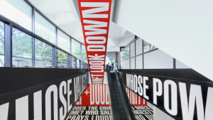
Barnbrook has also designed the materials for the upcoming exhibition David Bowie Is at the Victoria & Albert Museum in London. Barnbrook was on the panel helping put together the show and will showcase his "Doctrine" typeface for the public to view.
David Bowie Is will be on display from 23 March to 28 July 2013.


