First Published in

"Identity is what helps a country, an organisation, or a part of it, feel that it truly exists and that it is a coherent being, with a history and a place of its own, different from others." Jean-Noel Kapferer
The question of national identity - the essence of Brand South Africa - is complicated, but at the same time enriched by the diversity of a nation with a long history, 11 cultures, and multiple symbols to represent arts, culture and sport. Out of passion and commitment to the country, there has been no shortage of resources and propositions as to what the country should represent.
All the institutions representing Brand South Africa have done a commendable job thus far. Our flag, arguably one of the top five most recognised globally, is but one quilt of our diversity in which we can all wrap ourselves. This symbol of the nation has been taken up with enthusiasm, used in well over 100 identities of South African services, products and companies.
Yet we still lag behind other countries in putting forward a strong, singular message. What is required is to consolidate and leverage the strengths of what we own and what we've already invested in with the various institutions, in order to create a unifying brand essence and identity, which is true for investment, citizenship and tourism. So that we can excite the world.
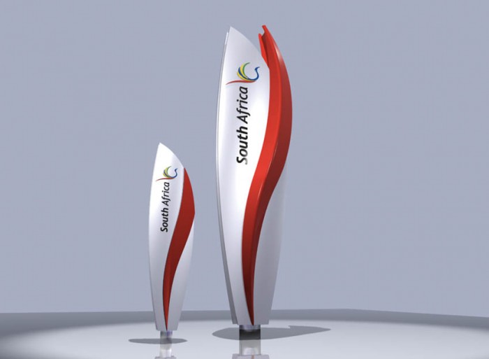
Expressing Brand South Africa visually presents a challenge, what with the country rich in symbolism spanning the fauna and flora, institutions, 11 languages and cultures. Two Tone chose to focus on the national bird, the blue crane, together with the vibrancy of the flag to create a new identity.
The national identity must capture the essence of the new South Africa, celebrate its diversity and honour its history.
Inspiration
The symbol should be a consolidation of all nation-branding initiatives.
Identity
The identity leverages two national assets, the globally recognised and vibrant South African flag and the national bird, in flight, to symbolise South Africa as a dynamic, vibrant and free country.
Brand architecture
A simplified brand architecture to represent the mother brand, South Africa, and the three pillars of nation branding: citizenship (live), commerce (invest) and tourism (visit).
Visual language
The tapestry of the South African identity is derived from the feathers of the blue crane in the primary colours of the South African flag.
Live
The FIFA World Cup South Africa 2010 presents South Africa with a unique opportunity to unite behind a unified brand identity.
Rather than having diverse symbols for national teams – rugby (springbok), cricket (protea) and soccer (soccer balls) – a common symbol should serve as a unifying symbol of team South Africa and the beacon of excellence for youth, the future of South Africa.
Invest
A common internal and external symbol and endorsement of the diversity of South Africa's enterprises and global investment opportunities.
Visit
The identity should be the symbol to identify iconic landmarks and welcome visitors to South Africa… And a symbol of our brand promise to visitors.
Let's keep at it!
Design Indaba commissioned three top agencies to apply their skills to the uber brand, South Africa, because we believe that there is a gap between our country's image and reputation, and the realities of its amazing achievements since democracy. Here's what switch, two tone and hklm have come up with to help close that gap.
- Brand the Beloved Country: Brief by Ravi Naidoo
- "Why Brand a Nation?": Thebe Ikalafeng asks Wally Olins and Simon Anholt
- Selling SA: "Feel it" by Switch
- Selling SA: "Flying high" by Two Tone
- Selling SA: "View to a thrill" by HKLM
"Identity is what helps a country, an organisation, or a part of it, feel that it truly exists and that it is a coherent being, with a history and a place of its own, different from others." Jean-Noel Kapferer
The question of national identity - the essence of Brand South Africa - is complicated, but at the same time enriched by the diversity of a nation with a long history, 11 cultures, and multiple symbols to represent arts, culture and sport. Out of passion and commitment to the country, there has been no shortage of resources and propositions as to what the country should represent.
All the institutions representing Brand South Africa have done a commendable job thus far. Our flag, arguably one of the top five most recognised globally, is but one quilt of our diversity in which we can all wrap ourselves. This symbol of the nation has been taken up with enthusiasm, used in well over 100 identities of South African services, products and companies.
Yet we still lag behind other countries in putting forward a strong, singular message. What is required is to consolidate and leverage the strengths of what we own and what we've already invested in with the various institutions, in order to create a unifying brand essence and identity, which is true for investment, citizenship and tourism. So that we can excite the world.
Expressing Brand South Africa visually presents a challenge, what with the country rich in symbolism spanning the fauna and flora, institutions, 11 languages and cultures. Two Tone chose to focus on the national bird, the blue crane, together with the vibrancy of the flag to create a new identity.
The national identity must capture the essence of the new South Africa, celebrate its diversity and honour its history.
Inspiration
The symbol should be a consolidation of all nation-branding initiatives.
Identity
The identity leverages two national assets, the globally recognised and vibrant South African flag and the national bird, in flight, to symbolise South Africa as a dynamic, vibrant and free country.
Brand architecture
A simplified brand architecture to represent the mother brand, South Africa, and the three pillars of nation branding: citizenship (live), commerce (invest) and tourism (visit).
Visual language
The tapestry of the South African identity is derived from the feathers of the blue crane in the primary colours of the South African flag.
Live
The FIFA World Cup South Africa 2010 presents South Africa with a unique opportunity to unite behind a unified brand identity.
Rather than having diverse symbols for national teams – rugby (springbok), cricket (protea) and soccer (soccer balls) – a common symbol should serve as a unifying symbol of team South Africa and the beacon of excellence for youth, the future of South Africa.
Invest
A common internal and external symbol and endorsement of the diversity of South Africa's enterprises and global investment opportunities.
Visit
The identity should be the symbol to identify iconic landmarks and welcome visitors to South Africa… And a symbol of our brand promise to visitors.
Let's keep at it!
Design Indaba commissioned three top agencies to apply their skills to the uber brand, South Africa, because we believe that there is a gap between our country's image and reputation, and the realities of its amazing achievements since democracy. Here's what switch, two tone and hklm have come up with to help close that gap.