The story goes that, after World World II (in 1946, to be exact), a bombed-out ballet company - replete with energetic dancers, the brightest of costumes, and too many play sets to mention – drove several overloaded trucks to England’s North-East to share the vibrancy of dance with a nation that was battling to get back on its feet.
Now, some 75 years later, the very same touring company – known as the Birmingham Royal Ballet (BRB) – maintains the lofty goal of moving people in important, even life-saving ways.
In his role as director of the BRB, 48-year-old Cuban-British dance icon Carlos Yunior Acosta, is on a mission to win new fans, stage new works, and highlight crucial social issues. Since joining the company in 2020, his aim has been to engage audiences with a bold identity that will be instantly recognisable all over the world.
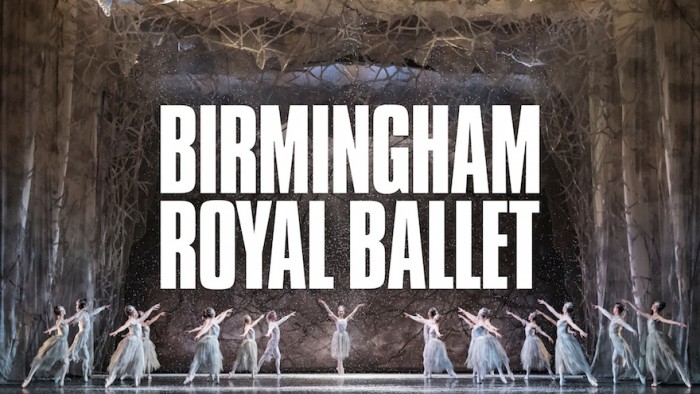
Acosta’s vision of a “world-class classical ballet everywhere” comes through in the fresh visual identity created by London-based design consultancy NB Studio. The new identity system has been built around the full-width application of an emphatic wordmark, complemented by a dramatic new colour palette and striking action photography to draw the viewer in.
The multi-platform refresh is designed to take ballet to places it’s never been before, says NB Studio’s creative director, Nick Finney. “The identity aims to be as dynamic, visceral, daring and beautiful as ballet itself.”
Finney says that working for the BRB was a unique experience. “A ballet company is a strange and wonderful beast,” he states. “On the one hand, you’re working with an intimate group of athletes, dancers who train incredibly hard every single day, pushing their bodies to the limit in the name of art. On the other, it’s also a business – a complex organisation with offices and departments, teams and artists. It is a major touring endeavour, a charity, an education, training and outreach provider.”
Navigating those tensions – along with the melting pot of ideas and cultures that lives alongside the grand tradition of classical ballet – was key to understanding who the BRB is and reflecting this in a bold new visual lexicon.
“When working with photographers, we soon learnt that there was so much more to capturing a leap than we had realised,” NB’s Design Director Sam Pittman explains. “So much work goes into the way the body is elevated, the hand is posed, the head is held, the line of the foot extended – the photographer has a goal in mind to create that one great shot for marketing, but is working under intense scrutiny and pressure to perform, too.”
Finney says it was important to put across the idea that ballet is inclusive – for everyone, everywhere – but at the same time, the imagery and layout had to “punch you right in the eye”. Marketing collateral had to appeal to all but at the same time be brave, distinctive, and bold.
Acosta feels the new identity chimes with his vision for the company, particularly as we emerge from pandemic lockdowns that kept audiences away.
“My take on this rebrand is that it has rallied our company into reaching out socially and turning up the volume on the special artistry in which we trade – especially in the areas of society, where it is needed most for enlightenment,” he asserts.
“If anything, the pandemic has made the BRB even stronger, even more determined to get out there and perform at their world-class best,” says Finney. “They have Carlos, and now they have a confident new brand identity to support them.”
The brand refresh is just what a quintessentially modern ballet company needs. As the UK’s premier touring ballet company, BRB strives to make its performances as relatable and interesting as possible, striking a balance between wooing young, diverse audiences and balletomanes with a love for the classics. NB Studio’s striking visual cues will help to underscore the relevance of ballet in a world of Netflix, TikTok and short attention spans.
Read more:
Katy Pyle’s Ballez is the inclusive dance studio you’ve been waiting for.
A ballerina’s tale.
Credits: NB Studio


