
Celebrating diversity and culture in Sydney's design industry, the 2012 Sydney Design Awards seeks to recognise professional designers, design commissioners and brand managers.
Frost* Design shines at this year's awards with 11 of their projects shortlisted. From brand identity creation to signage systems, here is a look at Frost* Design's outstanding work recognised by the Sydney Design Awards.
Chiswick restaurant identity, signage and collateral
With the launching of Matt Moran’s new restaurant, Chiswick Frost* Design was commissioned by MorSul to create a unique character for the relaxed diner. Being situated in a historic garden, its identity required an appreciation of the enclosed natural elements. Frost* Design used the botanical surroundings as inspiration for their creative processes. The end result of the design is elegant, sensual and grounded in the appreciation of the restaurant's "green" setting.

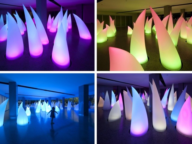
ActewAGL Ossalites
ActewAGL commisioned artist Robert Foster of Fink and Co. in collaboration with Frost*, to create a sculptural light installation for the foyer of its headquarters in Bunda Street, Canberra. Light filled shapes named "Ossalites" are programmed to create dramatic and interactive sequences of light, colour and movement throughout the installation.

Place-making, signage and environmental graphics for Rio Tino, Brisbane Regional Center
Paragon Project Management commissioned Frost* Design to create branding and environmental graphics for Rio Tino’s Brisbane Regional Center. The project required the numerous diverse business units of the company to be integrated to encourage collaboration between staff from various different sectors. Frost* Design took their inspiration from the rich visual language inscribed in the mining sector to create typography that captures the expanse of the mining landscape. The design result connects the office workers to the mineworkers through a visual landscape.

CBA Darling Walk
With Commonwealth Bank of Australia’s recent commitment to the long-term commercial lease of Darling Walk, they commissioned Frost* Design to create signage and branding graphics for the building. Frost* Design created a signage system that reflects the overall design objectives of the building. A real-time digital wall was installed to encourage staff engagement as well as lessening a printing impact on the environment. The digital wall displays necessary information while further communicating the environmental initiatives of Darling Walk.

Type 69
Frost* Design was approached by the ISTD (International Society of Typographic Designers) to design the 69th edition of the Journal of the International Society of Typographic Designers. The focus of the journal is on Australasian typography. Frost* Design listed the appropriate studios in Australia displaying examples of contemporary typography in the country. As Australia is known as the country "down under", the cover design mimics this with the number six reflecting the number nine.

One Shelley Street
With the refurbishing of level eight and nine at One Shelley Street headquarters, the company commissioned Frost* Design to create a unique working environment for their staff. Frost* Design collaborated with interior design team Woods Bagot to creative a flexible workplace vision. The starting point for the creative process was the floors. The duo decided to give each floor a theme serving as the basis for the rest of the interior. Level eight, “The Warehouse”, encompasses specific references to an industrial shipping wharf due to the site's historic positioning on a quayside. Level nine, “The Studio”, takes its inspiration from contemporary Japanese pop culture detailed flawlessly in its environmental graphics.

EYE "The Annual”
Frost* Design created a magazine that would capture the brand communication of international out-of-home media company EYE. Frost* Design’s main focus was to captivate customers. The magazine is a bold, playful and highly graphic communication piece as it allows for diverse opinion and comment on trends, technology and innovation.

National Trust Everglades
Everglades is situated in Sydney world heritage site Blue Mountains and is filled with cultural and historic beauty. With a need to upgrade the magnificent gardens, The National Trust of Australia commissioned Frost* Design to create a signage system that respects the gardens while informing the visitors of the Everglades' unique story. Frost* Design’s implementation of directional and informative signage is sympathetic to the natural landscape and takes on a leaf-inspired colour theme.

Stanmore Public School Library signage and environmental graphics
Frost* Design collaborated with Neeson Murcutt Architects to bring life to the Stanmore Public School library and surroundings. The library encompasses a series of colourful typography printed onto recycled carpet brightening the room and further serving as an information signage system. The project was continued outside the library with large-scale book quotes painted onto walkways and walls leading up to the playground.

Broken Hill/Broken Hill Studio’s brand identity
Broken Hill City Council commissioned Frost* Design to design a brand identity that would interconnect the two main sectors of the company: mining and film. The identity required the brand's essence of authenticity and strength to be captured in full. The main logo depicts crystal-like shapes reminiscent of the company’s mining sector. The "sister" logo double-plays on the image of a miner’s helmet replacing the headlamp with a film projector alluding to the film sector of the company. Frost* Design successfully connected both identities clearly.


Balla Restaurant identity and environmental graphics
Frost* Design developed a brand identity for Manfredi’s new restaurant, Balla, situated in the heart of Sydney. For the design process, Frost* Design’s influence for the traditional Italian restaurant came from the Italian Futurist Movement. From this inspiration, menus, coasters, letterheads, wine labels and signage was designed. The end result successfully defines traditional Italian dining in today’s world.


