Graphic designers Hat-trick have conceptualised an interesting poster project for the All England Lawn Tennis Club, better known as simply “Wimbledon”, which is soon to be launched.
Last year the creative duo worked on a comprehensive brand refresh for the famous tennis club.
In the past the tradition has been that one artist gets invited to design a new poster for the annual championships, creating an image that becomes associated with each year’s tournament.
This year Hat-trick wanted to create something that would reflect the more contemporary aspects of the tournament, by celebrating young design and emerging illustration talent. Hat-trick were also committed to injecting new energy into the championship posters.
For this reason they proposed an open competition which invited design and illustration students from local art schools and universities in Wimbledon and Kingston to submit proposals.
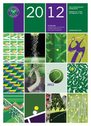
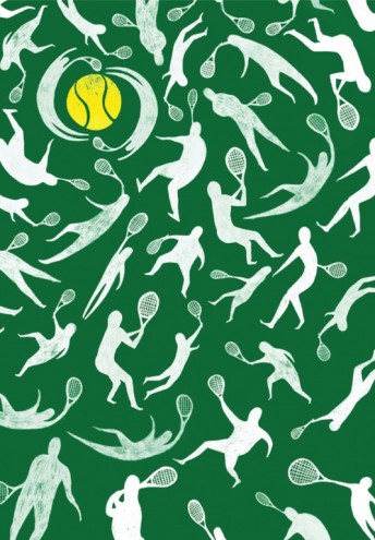
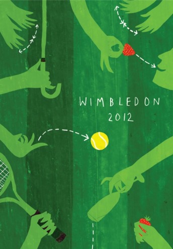
The 12 posters that were selected to represent the campaign are pictured here. They are specifically chosen as they reflect the diversity of the Wimbledon audience.
The plan was to select the 12 best images for 2012 to show a range of images and reflect the diversity of the audience.
The images will be used on the 2012 posters and in an exhibition during the Championships and online.

