If graphic designer Stephen Doyle has his way, words would be three-dimensional objects. In his “perfect playground” of creating ads, words would get up off the page and “literally cast a shadow”.
“They would be so tactile that they could enter the world along with us and have a life,” says the creative director and founder of New York-based design studio Doyle Partners.
Doyle lives in a world where “humanity rules, ideas cast shadows and colour talks”. He works by a credo of “magic, nonsense and macramé”: magic for campaigns that go beyond the brief and defy expectation, nonsense for the ability to step away from the realm of logic and macramé for the tactility of ideas become real.
He’s worked on illustrations, sculptures, environmental graphics, identity programmes, packaging, magazines, catalogues, books, videos and products over the long course of his career. He was awarded the Cooper-Hewitt National Design Award for Communication in 2010 and this year was presented with the AIGA Medal at its centennial gala.
Doyle is currently working on signage for the New York City Aquarium, which was commissioned by the Wildlife Conservation Society. He is collaborating with environmental artist Ned Kahn on the signage that will cover the building’s entire facade. The "low-tech" sign will use small aluminium tiles that move with the wind and reflect the sun to mimic the effect of water. Dispensing with the need for electrification, it embodies the client’s values of protecting the environment.
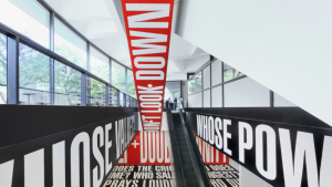
In 1995, he was tasked by the New York State Division for Women to mount a public installation celebrating the 75th anniversary of the 19th Amendment to the US Constitution, which gave women the right to vote. Faced with a limited budget, he created an impactful vinyl sign pasted in eight-foot letters on the floor of Grand Central terminal. It was difficult to read the entire sign but because the statement ended in the word “sex” it grabbed commuters’ attention.
“Just because of the scale and the context, we got people to read part of the Constitution of the United States without them even knowing it,” he says. “That’s the kind of seduction that I live for.”
In his most recent projects, he has been experimenting with taking graphic design into the physical realm with environmental graphics. “This is wonderful for me because it brings together graphic design, architecture, sculpture and very often, the public,” Doyle says.
When creating something new he asks himself, “How can I infiltrate the space with a story instead of smacking another sign in the world, another visual signal?”
How do we work viscerally and coat the surfaces that are there so that an idea or a story or a narrative might be a beacon to an audience, tap them on the shoulder and say ‘Yoo-hoo!’?
He fondly describes his studio as a “mess”, but it is all for the sake of channelling creative energy and original thought.
“The lovely thing about the studio is the hybridisation of these stories,” he says. “We try to be authentic and passionate and bring to all of our projects a little bit of humanity and a little bit of wit.”

