

First Published in
In the 1920s Rabindranath Tagore, India’s Nobel Laureate, visited the Bauhaus school in Weimar, Germany, to invite founder Walter Gropius and his contemporary Paul Klee to exhibit their work in India. It was a time when the reductive and functional aesthetics of the Bauhaus movement found its way into Indian offices in the form of the ubiquitous Cantilever chair.
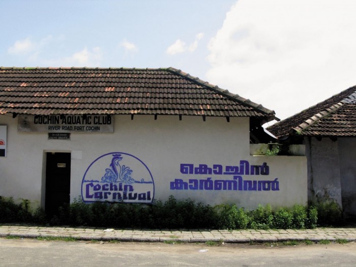
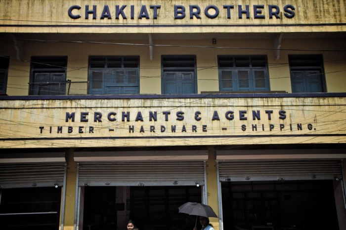
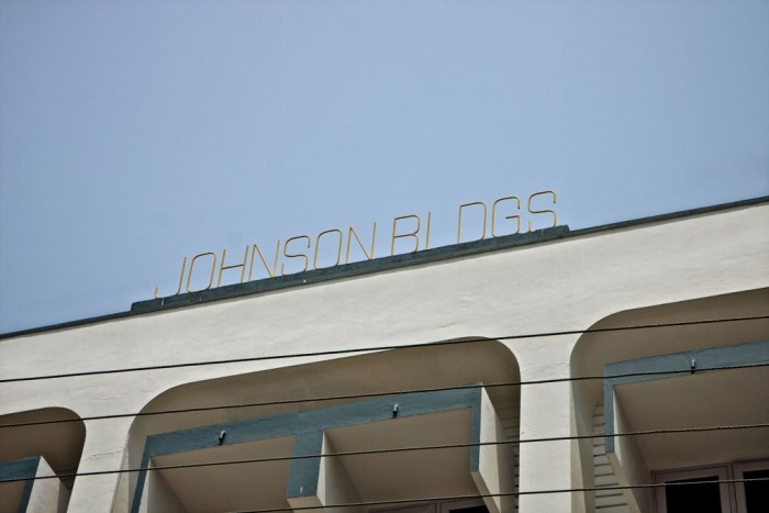
The typography also reflected this dynamic. The thriving industrial mood of the country was evident in the confident, geometric and elegant typefaces on building walls as well as shop fronts. Industrial functionalism soon became the objective of typographic exercises with sans-serif typefaces being employed in increasingly sophisticated compositions.
Post India’s 1947 independence, Bombay was home to the second largest collection of Art Deco buildings in the world, second only to Miami.
Over time, the Art Deco aesthetic developed into what Jon T Lang, an urban design expert and author of A Concise History of Modern Architecture in India, calls “Indo-Deco.” The clean, geometric lines of the sans-serif type gave way to its more decorative and ornamental counterparts seen at the time in the signage of small businesses, retail stores as well as cinema halls. Despite the endless variety of typefaces, what was consistently expressed was a proud and modern nation. To walk down the streets of Bombay and Delhi at the time, was to walk down the streets of a country that was sure of its own step.
As time changed, so did the materials. Wood and metal, so often used for lettering during the industrial era gave way to the paintbrush and a skill of a more personal kind. The time of the painter had arrived.
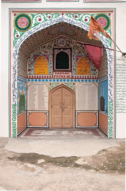
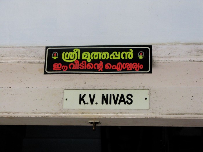
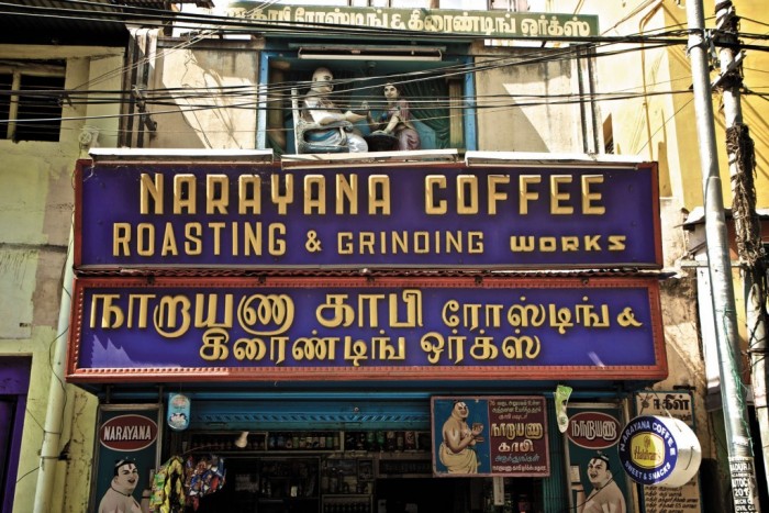
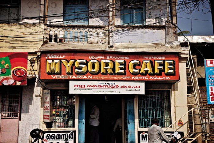
Painters – the talented men who painted signs – were considered artists, not just by their fellow painters but by clients as well. The prestige associated with being a painter meant that the profession had little trouble attracting talent. Every village, town and city was home to its own community of painters, each seeking inspiration from one other and each trying to outdo the other. Painters had their different styles: some painted only on white backgrounds, others utilised the drop shadow effect and others almost always gave their lettering a distinctive Bollywood poster aesthetic.
The notion of the painter as artist was reinforced by the artist’s signature often found at the bottom right corner of each commissioned piece. This was a time when commercialism and art worked in perfect harmony. And it was visible on every corner: tea stalls, juice shops and billboards.
The task of image making, it seemed, was solely in the hands of the local painters. This community now had the power to affect public spaces, public literature and public communication. Soon it was evident that painters weren’t just shaping the country’s landscape, they were shaping its identity, in the kitsch typography that India is globally known for.
Badal Chitrakar started his career as a painter in 1961. “I used to be an artist...but there was no money in artistry,” says Chitrakar. “People used to give me 50 to 100 rupees (US$2) for a portrait. So to keep my artistry alive, I had to work as a painter. So I did.”
His painting work kept him busy. From spending days finishing the lettering of an upcoming Bollywood film poster to deliberating over the finer strokes of Rs 10 per plate for the local food stall, Chitrakar’s skills were in demand. At a time when people valued quality, durability and detail, every piece he made possessed all of these qualities. But it also contained something more, something he calls “extra ordinary” – the painter’s touch.
Over the past two decades, the IT revolution in India has facilitated the advent of a society that is increasingly fixated with computers. The computer became a symbol of progress and to the enterprising individual, a legitimate avenue for business.
Along with software engineers, India also produced a large number of desktop designers. Pseudo designers with little knowledge of typography opened neighbourhood DTP (desktop publishing) shops across the country. These shops – typically cramped spaces with about five desktop PCs and pirated versions of Corel Draw – began churning out posters, shop signs and business stationery in their own super-glossy, hyper-Photoshopped aesthetic. Arial became their currency.
This democratisation of design is evident through the shift in influence from the painter, who lovingly decorated the public spaces with deft fingers, to the everyman with a computer and programs like Photoshop or Word.
Mahendra Patel, a design professor at the National Institute of Design in Ahmedabad, acknowledges how a computer-savvy culture has enabled its people to employ typography.
“With the computer even my secretary or wife can do typography,” he says.
Given the present scenario, Patel believes that design and typographic education have become even more critical.
Whether it is done by hand or on a computer, Patel argues the principles of typography never change. “If you see computers, we still talk about letter spacing, we still talk about leading, we still talk about sizes, so the basic structural element, which is text typography, remains the same.”
Perhaps what has become increasingly relevant is the need to document the older styles of typography.
Kurnal Rawat, founder of the design studio, Grandmother India, brilliantly documents the loss of Bombay’s typography in his seminal project, TyPoCiTy.
Rawat, with funding from grants, spent two years decoding Bombay, “through a typographic lens.” In the project’s initial year, Rawat discovered that many of the city’s beautiful signs, many of which were engraved into building walls, disappeared as the buildings themselves were torn down.
“The architectural landscape was changing and a lot of the typography vanished with that. So we saw the urgency [to document] and reapplied for a bigger grant to broaden the project,” says Rawat.
Patel emphasises the need for projects like TyPoCiTy as a way of codifying and historically referencing typography. “Unfortunately, Indian design doesn’t have good documentation. Or shall we say, a history of recognition,” he says.
Chitrakar himself is playing out his part to preserve typography by teaching.
In his modest house in labyrinthine Old Delhi, Chitrakar shows students how to paint and draw. One student, he observes, does something very different to what Chitrakar himself was taught to do; the student creates a painting on his computer then attempts to reproduce the image on canvas.
This practice signifies a broader trend in India to merge handcrafted work with technology.
In India, there is urgency and change. Designers across disciplines now talk about engaging with local artisans – for both preservation and exploration.
Not long ago, Ogilvy & Mather in Mumbai commissioned local painters in the southern city of Chennai to create a print campaign that was a pastiche of giant, hand-painted political posters, for which the city is renowned.
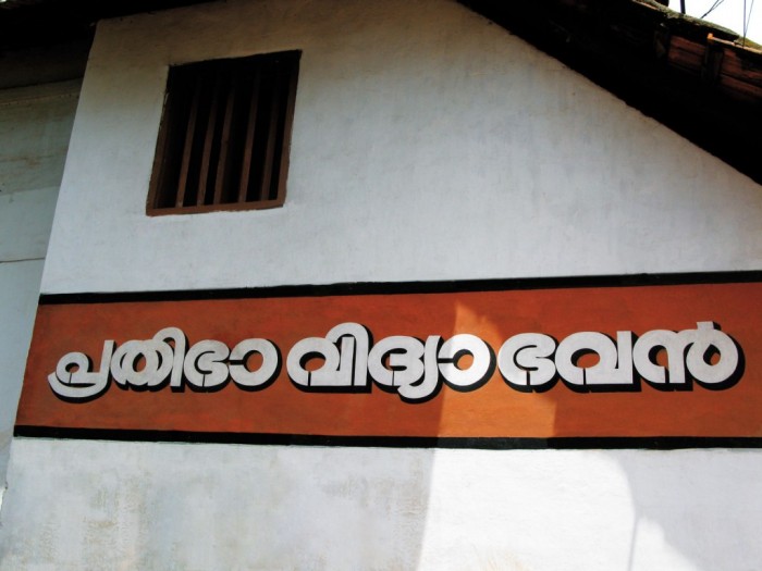
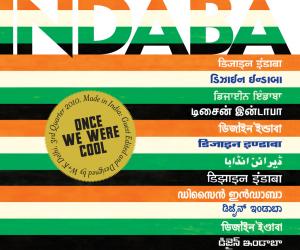
But what really dominates the design discourse among its practitioners today is the use of regional languages. India is home to over 20 officially recognised languages and their accompanying scripts, none of which have seen any development over the years. The typefaces have largely remained the same and in the hands of the few local practitioners. The opportunity to modernise these typefaces, to formalise them and to make them accessible to designers across studios and advertising agencies in India and abroad, is immense.
This is something Rawat firmly believes in.
“I see a possibility of an outburst of the regional stuff in a completely modern way. The regional work can be surprisingly stronger than the English work. You even see mobile companies forced to do their ads and promotional material in regional type to connect with the audience. So I think there is scope for that. I think the Indian typographers should go beyond just the Roman alphabet and think more regional,” says Rawat.
Professor Patel’s students are doing just that. According to him, students are increasingly looking at producing work that derives from local culture and practices – typography included. “To my students, I explain known script and unknown script. So for example, a student from Maharashtra will work on a script in Telugu (another regional language),” he says. “I want my students to respect other states, to know about the vernacular differentiation and deal with it.”
So does all this mean that we will return to the days of considered typography and design across disciplines? Will the need for local language scripts demand a closer collaboration with local artists and painters and could this collaboration lead to an altogether new aesthetic?
Whatever happens, the role of typography in shaping cultures and environments will remain crucial. It will continue to be an accurate window into the time it reflected and occupied. But most of all, it will further emphasise the idea that to understand and investigate cultures, time and space, you simply have to start with the type.
Despite the endless variety of typefaces, what was consistently expressed was a proud and modern nation.
India has always been known for craftsmanship. But what has also been at the heart of the country’s identity is modernism fuelled by a rich and continuous exchange with the outside world, which has remained a constant theme in the country’s political and cultural history.
In the 1920s Rabindranath Tagore, India’s Nobel Laureate, visited the Bauhaus school in Weimar, Germany, to invite founder Walter Gropius and his contemporary Paul Klee to exhibit their work in India. It was a time when the reductive and functional aesthetics of the Bauhaus movement found its way into Indian offices in the form of the ubiquitous Cantilever chair.
The typography also reflected this dynamic. The thriving industrial mood of the country was evident in the confident, geometric and elegant typefaces on building walls as well as shop fronts. Industrial functionalism soon became the objective of typographic exercises with sans-serif typefaces being employed in increasingly sophisticated compositions.
Post India’s 1947 independence, Bombay was home to the second largest collection of Art Deco buildings in the world, second only to Miami.
Over time, the Art Deco aesthetic developed into what Jon T Lang, an urban design expert and author of A Concise History of Modern Architecture in India, calls “Indo-Deco.” The clean, geometric lines of the sans-serif type gave way to its more decorative and ornamental counterparts seen at the time in the signage of small businesses, retail stores as well as cinema halls. Despite the endless variety of typefaces, what was consistently expressed was a proud and modern nation. To walk down the streets of Bombay and Delhi at the time, was to walk down the streets of a country that was sure of its own step.
As time changed, so did the materials. Wood and metal, so often used for lettering during the industrial era gave way to the paintbrush and a skill of a more personal kind. The time of the painter had arrived.
Painters – the talented men who painted signs – were considered artists, not just by their fellow painters but by clients as well. The prestige associated with being a painter meant that the profession had little trouble attracting talent. Every village, town and city was home to its own community of painters, each seeking inspiration from one other and each trying to outdo the other. Painters had their different styles: some painted only on white backgrounds, others utilised the drop shadow effect and others almost always gave their lettering a distinctive Bollywood poster aesthetic.
The notion of the painter as artist was reinforced by the artist’s signature often found at the bottom right corner of each commissioned piece. This was a time when commercialism and art worked in perfect harmony. And it was visible on every corner: tea stalls, juice shops and billboards.
The task of image making, it seemed, was solely in the hands of the local painters. This community now had the power to affect public spaces, public literature and public communication. Soon it was evident that painters weren’t just shaping the country’s landscape, they were shaping its identity, in the kitsch typography that India is globally known for.
Badal Chitrakar started his career as a painter in 1961. “I used to be an artist...but there was no money in artistry,” says Chitrakar. “People used to give me 50 to 100 rupees (US$2) for a portrait. So to keep my artistry alive, I had to work as a painter. So I did.”
His painting work kept him busy. From spending days finishing the lettering of an upcoming Bollywood film poster to deliberating over the finer strokes of Rs 10 per plate for the local food stall, Chitrakar’s skills were in demand. At a time when people valued quality, durability and detail, every piece he made possessed all of these qualities. But it also contained something more, something he calls “extra ordinary” – the painter’s touch.
Over the past two decades, the IT revolution in India has facilitated the advent of a society that is increasingly fixated with computers. The computer became a symbol of progress and to the enterprising individual, a legitimate avenue for business.
Along with software engineers, India also produced a large number of desktop designers. Pseudo designers with little knowledge of typography opened neighbourhood DTP (desktop publishing) shops across the country. These shops – typically cramped spaces with about five desktop PCs and pirated versions of Corel Draw – began churning out posters, shop signs and business stationery in their own super-glossy, hyper-Photoshopped aesthetic. Arial became their currency.
This democratisation of design is evident through the shift in influence from the painter, who lovingly decorated the public spaces with deft fingers, to the everyman with a computer and programs like Photoshop or Word.
Mahendra Patel, a design professor at the National Institute of Design in Ahmedabad, acknowledges how a computer-savvy culture has enabled its people to employ typography.
“With the computer even my secretary or wife can do typography,” he says.
Given the present scenario, Patel believes that design and typographic education have become even more critical.
Whether it is done by hand or on a computer, Patel argues the principles of typography never change. “If you see computers, we still talk about letter spacing, we still talk about leading, we still talk about sizes, so the basic structural element, which is text typography, remains the same.”
Perhaps what has become increasingly relevant is the need to document the older styles of typography.
Kurnal Rawat, founder of the design studio, Grandmother India, brilliantly documents the loss of Bombay’s typography in his seminal project, TyPoCiTy.
Rawat, with funding from grants, spent two years decoding Bombay, “through a typographic lens.” In the project’s initial year, Rawat discovered that many of the city’s beautiful signs, many of which were engraved into building walls, disappeared as the buildings themselves were torn down.
“The architectural landscape was changing and a lot of the typography vanished with that. So we saw the urgency [to document] and reapplied for a bigger grant to broaden the project,” says Rawat.
Patel emphasises the need for projects like TyPoCiTy as a way of codifying and historically referencing typography. “Unfortunately, Indian design doesn’t have good documentation. Or shall we say, a history of recognition,” he says.
Chitrakar himself is playing out his part to preserve typography by teaching.
In his modest house in labyrinthine Old Delhi, Chitrakar shows students how to paint and draw. One student, he observes, does something very different to what Chitrakar himself was taught to do; the student creates a painting on his computer then attempts to reproduce the image on canvas.
This practice signifies a broader trend in India to merge handcrafted work with technology.
In India, there is urgency and change. Designers across disciplines now talk about engaging with local artisans – for both preservation and exploration.
Not long ago, Ogilvy & Mather in Mumbai commissioned local painters in the southern city of Chennai to create a print campaign that was a pastiche of giant, hand-painted political posters, for which the city is renowned.
But what really dominates the design discourse among its practitioners today is the use of regional languages. India is home to over 20 officially recognised languages and their accompanying scripts, none of which have seen any development over the years. The typefaces have largely remained the same and in the hands of the few local practitioners. The opportunity to modernise these typefaces, to formalise them and to make them accessible to designers across studios and advertising agencies in India and abroad, is immense.
This is something Rawat firmly believes in.
“I see a possibility of an outburst of the regional stuff in a completely modern way. The regional work can be surprisingly stronger than the English work. You even see mobile companies forced to do their ads and promotional material in regional type to connect with the audience. So I think there is scope for that. I think the Indian typographers should go beyond just the Roman alphabet and think more regional,” says Rawat.
Professor Patel’s students are doing just that. According to him, students are increasingly looking at producing work that derives from local culture and practices – typography included. “To my students, I explain known script and unknown script. So for example, a student from Maharashtra will work on a script in Telugu (another regional language),” he says. “I want my students to respect other states, to know about the vernacular differentiation and deal with it.”
So does all this mean that we will return to the days of considered typography and design across disciplines? Will the need for local language scripts demand a closer collaboration with local artists and painters and could this collaboration lead to an altogether new aesthetic?
Whatever happens, the role of typography in shaping cultures and environments will remain crucial. It will continue to be an accurate window into the time it reflected and occupied. But most of all, it will further emphasise the idea that to understand and investigate cultures, time and space, you simply have to start with the type.