First Published in

The point of the picture choice begins with an issue that has been concerning me for a little while. I have noticed that the winds of change have been whistling through graphic design communications this year. There seem to have been more styles being touted than I can shake a stick at. If it isn't retro-tech meets late deco, then it must be garage graphics juiced on revived psychedelia. All the while the New International Movement moves stealthily forward: indeed I'm a bit guilty of spreading that Helvetica myself.
Is all this variety significant? Is it something economic? Or is it evidence of the sheer ephemerality of our two-dimensional world?
I was having a discussion in the studio the other day about this troubling variety. We bantered a bit about modernism and minimalism and deviations from those wisdoms. Oh yes, we know how to have fun in the workplace. Anyway, a colleague I respect a great deal proved to be a hard-line follower of the great architect Mies van der Rohe. He's the man reputed to have come up with the line 'less is more', which he proceeded to exercise with exquisite control in several immensely influential office buildings. They were finely detailed constructions - after all, 'God is in the details' was another line associated with the modern movement. Unfortunately Mies's architectural followers became the bane of city planning, with their dull, unthinking replays of the modernist office block in a large way responsible for prompting post-modernist excess.
So when my colleague argued the case for Mies, I sprang in with a few instances of how wrong-headed the great architect's principles had turned out to be when handled by lesser skilled designers. The point I was making was that principle only gets you so far (indeed, that 'reason' only gets you so far in the visual arts). There is still a big space that falls to intuition, to the creative act that pulls a little magic (or not) out of the air and differentiates the beautiful from the damned - say Mies's exquisite Farnsworth House from a thousand other bad modernist flat-roof slums…
Beyond this, I also sought to make the point that what counts in all creative arenas - from architecture and city planning, to typography, photography, or music - is making the right sort of difference. You have to make a meaningful mark, not dully follow principle. That then introduces the elements of beauty and delight and surprises us with new appropriateness. What applies in architecture works the same in graphics: the modernists begat the Swiss style begat the International Style that became a dull orthodoxy until people reacted violently against it. A few years of Post-Modern and then Deconstruction excesses, resulting in the torrid typographic breakdown of the 1990s, left us gasping for a little relief. The sorbet course was due after all the riches - which brought back new variants of Swiss and International Style...
This gets me back to my take on the current 'troubling variety' that I mentioned above. I think we are in a holding pattern at present, where we can select various styles from the graphic toolbox of our day. They suit different purposes, but no one is really that strong, that dominant. What is emerging is the situation for a new thrust, a new synthesis that will be at first remarkably fresh, and then become the new orthodoxy. Then, of course, it will get overworked and we'll tire of it, react against it and start looking for the next big thing.
What we need right now is that new thing. My guess is that it is going to come by some convergence of modernist principles with lessons learnt out of the new media innovations. In the process we will be able to throw out any retro elements of modernism, and arrive at a true 'late modernism': an inspiring new half art, half science solution to how to be graphic designers. It will look really smart for all of a couple of years.
In this progression we will see the inevitable reaction to 'Less is more'. It will be 'more is more' and 'less is less' combined! A complete graphic theory that will allow us to turn the volume up or down on communications.
So there you have it. Now just bring it to life.
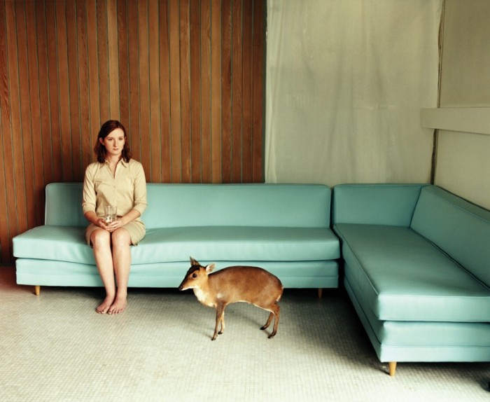
And the picture? Well, I like it. It's an award-winning shot by Kyoko Hamada, a great young photographer who has been working with us recently (shooting this image as part of a series of people with animals in unusual settings, with surprising meanings). In its highly modern, and yet curiously classic combination, pared down and yet rich in detail, allusive and infinite in meaning, it seems to capture, in photographic form, the theory that currently lies beyond hard principle.
It captures the following mantra: Sometimes you want more, sometimes you want less. Usually when you have had a lot of more, it is time for less. And when you have had less for a while, it is time for more.
Sometimes that is as much principle as you need in communication. More important is to have something to say. Like "this picture looks a little empty right now. I know, let's put a muntjac in it."
Lewis Blackwell is a writer and speaker on creativity. He spends a lot of his time being the creative director of Getty Images, the world's leading visual content provider. His books on design and communication include some of the best selling design titles of the past decade. His most recent book, Soon, will be out in January 2002 and will be the subject of his talk at the 5th International Design Indaba® where he will also act as master of ceremonies.


