First Published in

Graphic designer Jan Erasmus has documented his 25-year career in Intrigue. Offering thorough coverage of Erasmus’s work and process, the book also interestingly corresponds with possibly the most dynamic period of South African and graphic design history.
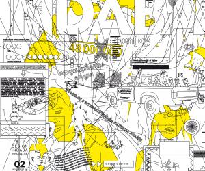
Responsible for the widely used Thornface and Transition fonts, as well as the Nando’s font and the 2010 FIFA World Cup font, Menyaka, Erasmus’s typographical design is literally written all over South Africa’s streets.
Receiving a diploma in graphic design from Wits Technikon in 1975, Erasmus went on to complete his postgraduate studies at Philadelphia College of Art. Long before computers and digital photography, Erasmus’s background in black-and-white photography and hand-drawn letterforms still comes through in the structural and textural quality of his contemporary work.
The transition to technology was whole-hearted though, with Erasmus becoming South Africa’s first distributor of electronic fonts in 1992. Using direct mail to market his software, Erasmus’s radical flyers were inspired by the tempestuous political climate of the day. Increasingly becoming a promoter of the digital age of graphic design, it was only a matter of time for Erasmus to start designing his own fonts.
Featuring only a preface and introduction by Carl Lamprecht, the evolution of Erasmus’s work is told through the humble, self-aware voice of the creator himself. Intrigue is a monograph that is more significant than just Erasmus’s career, giving an account of the undocumented history of South Africa’s graphic design industry, through the political and digital transitions.
Graphic designer Jan Erasmus has documented his 25-year career in Intrigue. Offering thorough coverage of Erasmus’s work and process, the book also interestingly corresponds with possibly the most dynamic period of South African and graphic design history.
Responsible for the widely used Thornface and Transition fonts, as well as the Nando’s font and the 2010 FIFA World Cup font, Menyaka, Erasmus’s typographical design is literally written all over South Africa’s streets.
Receiving a diploma in graphic design from Wits Technikon in 1975, Erasmus went on to complete his postgraduate studies at Philadelphia College of Art. Long before computers and digital photography, Erasmus’s background in black-and-white photography and hand-drawn letterforms still comes through in the structural and textural quality of his contemporary work.
The transition to technology was whole-hearted though, with Erasmus becoming South Africa’s first distributor of electronic fonts in 1992. Using direct mail to market his software, Erasmus’s radical flyers were inspired by the tempestuous political climate of the day. Increasingly becoming a promoter of the digital age of graphic design, it was only a matter of time for Erasmus to start designing his own fonts.
Featuring only a preface and introduction by Carl Lamprecht, the evolution of Erasmus’s work is told through the humble, self-aware voice of the creator himself. Intrigue is a monograph that is more significant than just Erasmus’s career, giving an account of the undocumented history of South Africa’s graphic design industry, through the political and digital transitions.