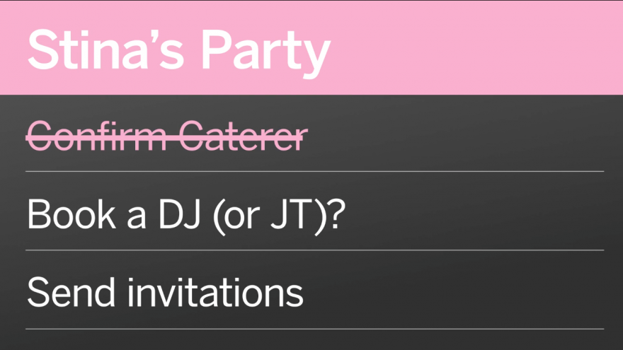
Busybodies, OCD freaks and even regular forgetful folk can now benefit from the organisational skills of interaction designer (and super busy person) Jakob Trollbäck, who has created a new app based on his own tribulations coordinating his various to-do lists. Organize from creative agency Trollbäck+Company is a great way to keep track of your tasks and deadlines. The app uses colour coding to help you categorise your lists and assigns deadlines to specific tasks. It also makes it easy to re-order or swipe between lists, as well as to share your lists through email or text message.
Trollbäck answers a few quick questions about the genesis of the idea and app.
What prompted the design of the app?
I always used my phone to write down ideas, recommendations and to-do lists. The problem is later when you are looking for a restaurant among your notes, you have to browse through years of notes. I wondered why there wasn't a system with pages or tabs to organise it all.
Tell us a little about the development process and how it evolved?
We had a lot of conversations about efficiency and inspirational tasks and how to prioritise creative goals. I wanted the app to help you, nudge you to get going on personal projects and adventures. I wanted to have daily goals etc. In the end though, we decided that the first priority was to create order out of chaos. So for now anyway, it will be up to each and everyone to be motivated and act on your lists.
What differentiates the app from other digital organising tools?
There are so many apps. Gosh... It's a sobering experience to have an app idea that you are totally psyched about and then search for that very app. Most apps, maybe all apps that you can think of, have already been done and can be bought right away. But a huge majority of them are also degrees of ugly and have many levels of illogical and random user interface. The Organize app is simple and logical. Just like our wonderful best-selling stop-motion and time-lapse app STEP, the design and user interface is in a class of its own – in my humble opinion.
Why is it better than the good old pen-and-paper list with tick boxes?
It's not. If you always walk around with paper and pen that is. You can, however, email or text your lists of favourite bars to a friend – and that is much easier than making a paper plane of your list and then losing it in the throw.
What to-do lists are currently on your own Organize app?
Work, Personal, This Week, Music, Movies, Restaurants, Long Term Projects, Buy This, T+Co Products, Apple Mistakes and EMS Documentary.


