From the Series
You’re familiar with the scene: You’ve spent a couple of hours in a shopping centre (or other large concrete structure). Exhausted, you head out to the parking lot and you simply cannot remember where you parked the car.
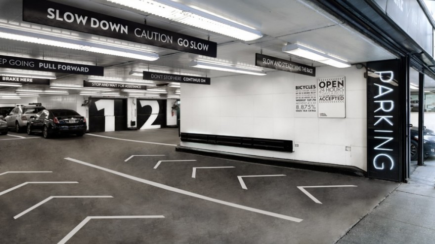
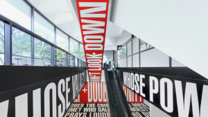
Such situations are a possible prelude to road rage, but Pentagram’s Paula Scher has designed a set of graphics that could make these vast garages easier to navigate. Her designs for a Midtown Manhattan garage works to ensure that drivers do not forget where they parked.
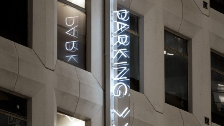
The owners of the seven-storey garage in question wanted to upgrade the facility while also implementing a new set of environmental graphics. Scher originally wanted to fill the windows of this large structure with the words “did you remember where we parked the car?” but regulations demanded more traditional forms of signage.
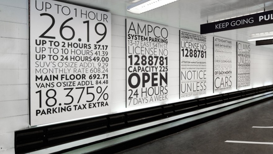
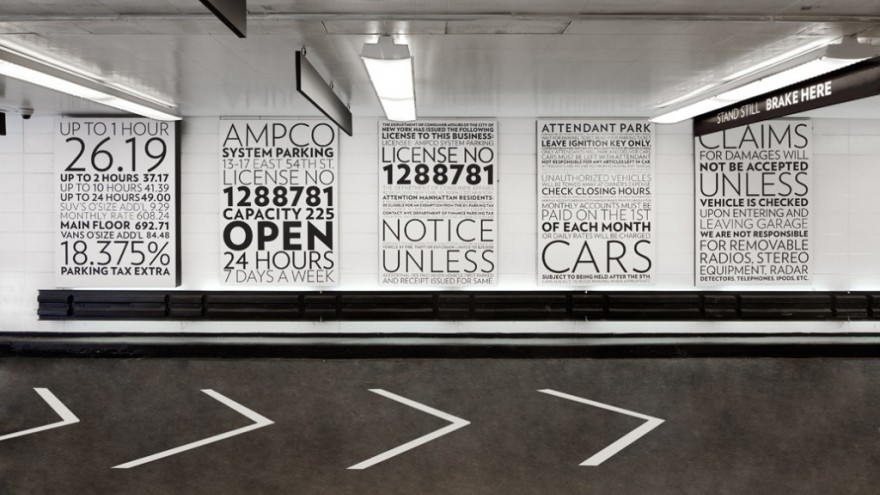
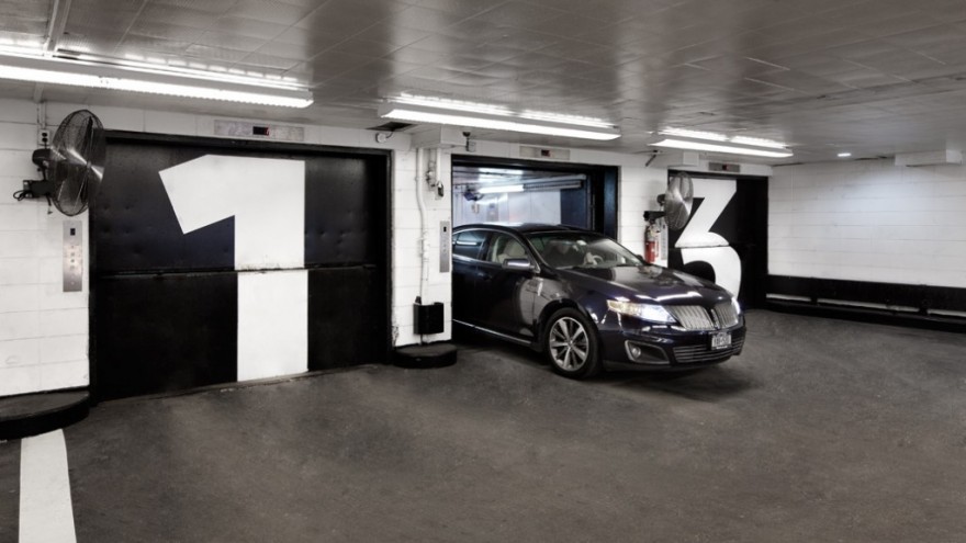
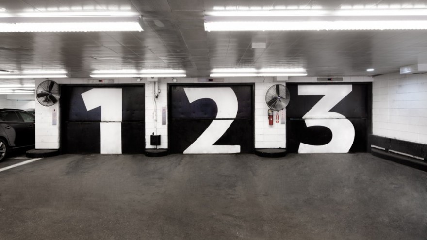
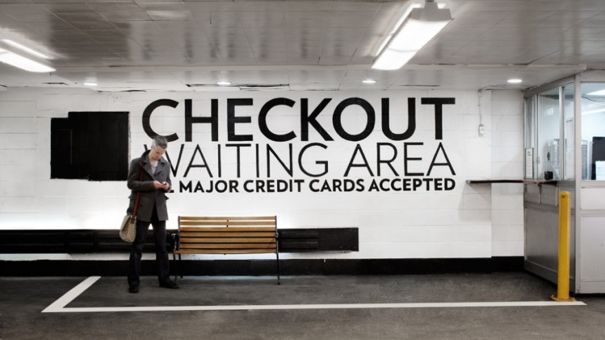
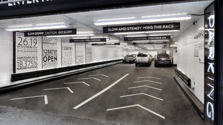
Inside the parking garage the signage works like a navigator slash backseat driver. Using the Verlag typeface, the signage includes instructions for drivers like “slow and steady wins the race” and “don’t stop here, continue”, as well as really large graphics indicating the different parking levels and elevator locations.

