From the Series
The New York City Department of Parks and Recreation manages and maintains some 29 000 acres of land, one of the world’s largest urban park systems. For millions of New Yorkers and visitors to the city, the department’s green leaf symbol is synonymous with relaxation.
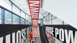
Now Paula Scher has worked with the department to create a new visual identity to ensure a more unified, accessible and modern image for the popular agency. The new identity includes different forms of signage, way-finding and environmental graphics for more than 1 700 parks, playgrounds and other recreation facilities.
One of Scher’s key challenges was to create a visual standard for the Parks livery that could be used for all materials. Despite the Parks leaf logo being one of the most iconic symbols in New York, it was not instantly recognisable as belonging to Parks.
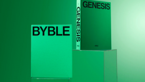
Scher started by giving the leaf logo a more contemporary look. In addition to streamlining the leaf by smoothing out its edges and thinning the line of the surrounding circle, Scher also changed the colour. Rather than a generic forest green, the Parks leaf logo is now a modern, bright green.
The name has also changed from the New York City Department of Parks and Recreation to the shorter, more user-friendly NYC Parks. The primary font for the identity is Akkurat with Chronicle as the secondary typeface.


