Illustrator and pop artist Keith Vlahakis describes himself as a proliferator of good vibes. His signature lettering style is inspired by a mixture of classic serif looped typography and the fluid daintiness of late nineteenth century Art Nouveau Poster Design.
His pop art projects deal with nostalgia and are influenced by the memories of being a kid in the nineties, obsessed with rap music, sci-fi movies and video games. Juggling commercial advertising work and personal projects, Vlahakis uses Instagram to its fullest potential.
We hit him up to uncover the process behind some of his much-loved works.
Set Potential Free
This was a typographic mural I painted for FCB Cape Town [South Africa] inside their creative studio early last year. The idea was fairly simple, I was given a huge blank wall inside their studio and the brief was to use their company motto - "Set Potential Free" as the main visual element for the mural.
At first, I was given complete creative freedom in the brief, and I illustrated a very detailed colourful, pop art inspired piece [the First draft can be seen above]. The agency completely bombed that first option but then referenced one of my type pieces in my portfolio to guide me to what they wanted.
The type piece they referenced was done in my signature style, a style that's inspired by classic serif looped typography but also has a fluid abstract daintiness through its flourishes that loop, curl and intertwine with each other to make the composition whole. Once I completed that new sketch, It was approved immediately. The hardest part was over.
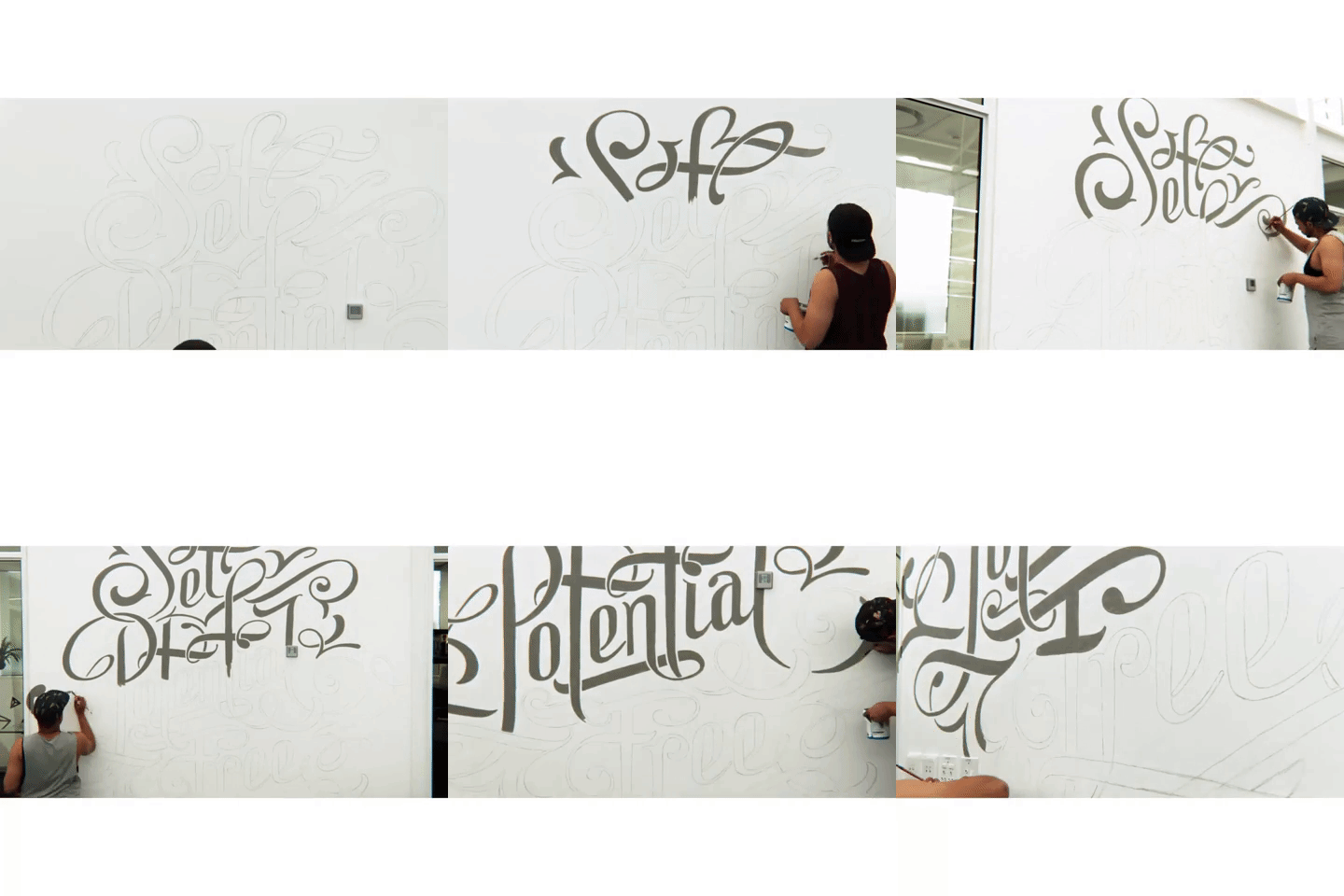
I then mocked it up digitally in Manga Studio and used that as a guide to start painting. The entire mural took three days in total, first sketching it out in pencil on the wall then painting with wall acrylic. We were fortunate to get the guys at Hello Computer to do a time-lapse video of the process.
Pink Horse Origami
The Pink Horse Origami lettering collaboration with Ross Symons of White on Rice. This one can be described as: "An elegant union of his Origami & My Abstract typographic flourishes".
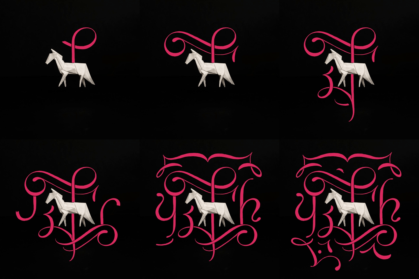
The horse was part of a three part series we did for social media that sprang out of a conversation we were having over coffee. We both have an admiration for each other's work and figured we had to do a collaboration. He sent me three images of his origami which were a butterfly, a unicorn and a horse. I then looked at them and tried to imagine the typographic flourishes moving to a classical song. I planned to draw them in a way that somehow had a distinct almost musical rhythm to their motion. So then the actual process of illustrating the typographic flourishes would be the work of art and we would only see the complete end composition for a brief moment at the end and then it would repeat. So it was almost like a performance of some sort.
Lady Liberty
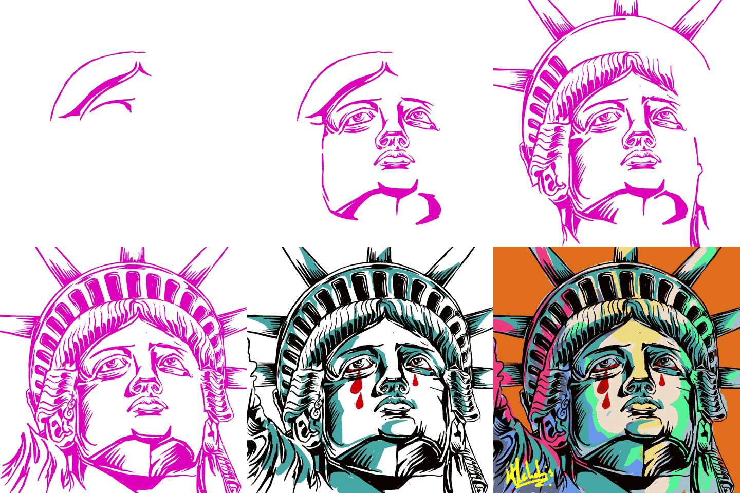
The Women's March anti-Trump video was a project that was done for a blog in the United States around the time of the march. My work isn't usually politically charged but that day was so powerful in terms of a global movement that I had to join in the conversation, and I was thrilled when a small brief actually popped up. The idea was to take the iconic lady liberty statue and illustrate her as a character who was also disgruntled and angry at Trump being in power and the state of the USA regarding women's rights in particular.
Vlahakis’ upcoming Cape Town-based exhibition Popular Culture For Breakfast, Lunch and Supper is an Illustration exhibition of some of the work he has created over the last two years inspired by cult film classics, sci-fi, rap music and other pop cultural phenomenon. If you’re not in the city, you can find him on Instagram.


