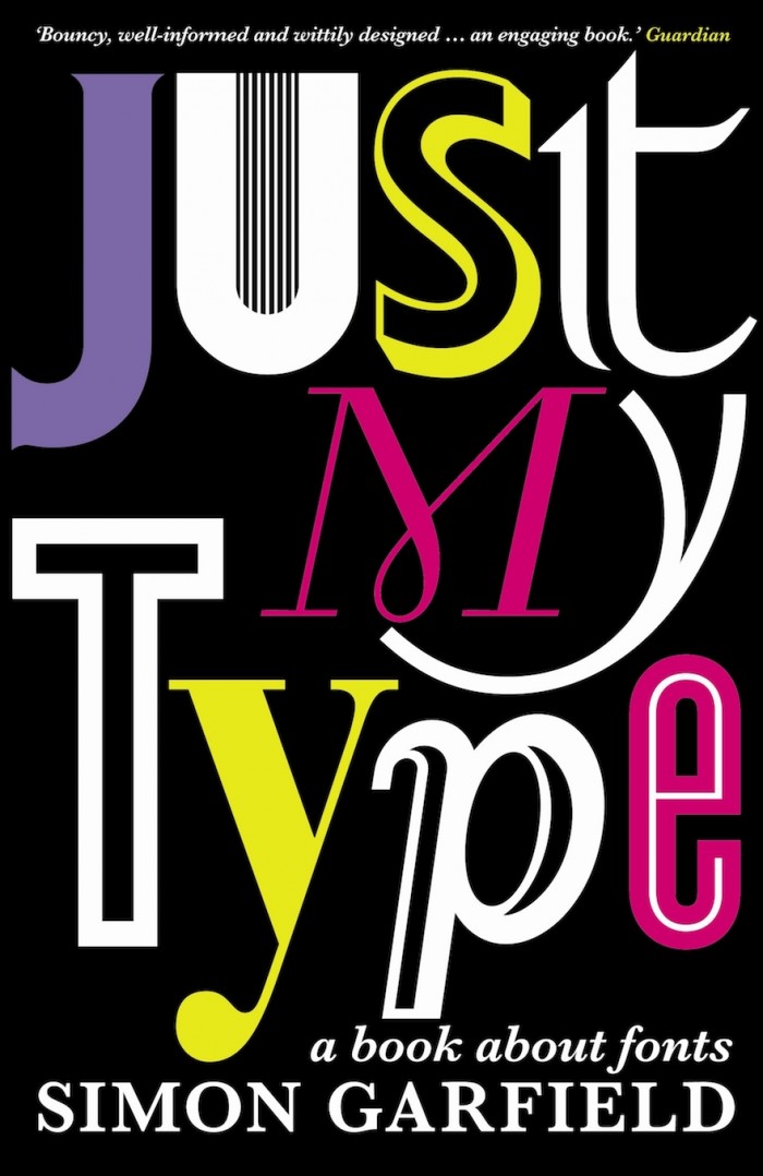
If you’re not one of those people who waxes lyrical about how letters look on the page or billboard, no matter. Your role as reader of this bestseller from Simon Garfield is to learn about the history behind some of the world’s most fetching and frustrating fonts.
“Fonts were once known as founts. Fonts and founts weren’t the same as typefaces, and typefaces weren’t the same as type,” Garfield explains to the uninitiated in this 2010 classic.
The author investigates everything from the documentary ‘Helvetica’ – and how the font can make a big company appear neater and more systematic than it really is – to the reason why Comic Sans ranks as an unattractive, primary school-type script for the semi-literate. We learn about Obama’s campaign font (Gotham), Russell Crowe’s favoured typeface on the hit movies in which he’s starred (Trajan), and why Baskerville, Futura and Garamond are considered ‘vampiric’. We also learn about Steve Jobs’ revolutionary idea to offer a choice of fonts on our PCs.
In this font-inspired journey, Garfield explores arcane mysteries like why the drop-T in the Beatles logo extends further downwards than any of the other letters, for example. Legend has it that Ringo Starr wanted a new set of drums, so he and Brian Epstein headed up to Drum City on Shaftesbury Avenue, where the store owner, Ivor Arbiter, demanded that the Ludwig logo be prominent on the band’s logo and sketched it on the spot. The rest is history.
Garfield is good with backstories: like the story behind the creators of the fonts we all know and love (or love to hate). Who knew that Gill Sans creator Eric Gill was an incestuous sexual deviant, leading to calls for his works to be removed from public buildings and art collections? Taking fonts at (type)face value is no longer possible once you’ve read this intriguing whistle-stop tour – and Garfield is quick to dismiss those fonts he simply can’t stand, like the London 2012 Olympics font.
Although purists may consider the book somewhat superficial, it’s a great primer for the font-curious, and money well spent.
Read more:
The climate crisis font.
Text messaging.
Live art.
Credits: Profile Books


