

First Published in

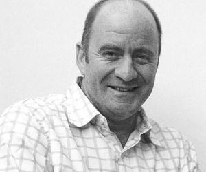
Tobias Frere-Jones was born in 1970 in New York, and after graduating from Rhode Island School of Design, joined Font Bureau Inc in Boston. During his seven years as senior designer, Frere-Jones created many of Font Bureau's best-known typefaces, including Interstate and Poynter Oldstyle and Gothic. He then joined the faculty of the Yale School of Art, where he continues to teach typeface design at graduate level.
In 1999 he left Font Bureau to return to New York, where he began work with Jonathan Hoefler. Under the name Hoefler & Frere-Jones, the two collaborated on projects for Martha Stewart Living, GQ, Esquire, Nike, Pentagram, Hewlett-Packard and others. Frere-Jones's work is included in the permanent collection of the Victoria and Albert Museum, London; he is on the board of the New York chapter of the American Institute of Graphic Arts; and last year, he became the first American to receive the Gerrit Noordzij Award, presented by the Royal Academy of the Hague in honour of his special contributions to typography.
Typography talk
Garth Walker of Orange Juice Design in Durban asks Frere-Jones about his fondest typographic memories, the impact of technology on type and what qualities make for a good typographer.
Do you have a personal favourite (typeface)? And why?
I'd have a hard time picking just one, as there are so many different ways I could come to admire a typeface, both as a designer and a reader. My fondest (and earliest) typographic memories are of Gill Sans, and of the lettering on National Geographic maps. They had beautiful shapes and loud, clear personalities; they showed me that the shape of a letter could be a message by itself. As a designer, I have to marvel at the original hot-metal Caledonia, by W A Dwiggins. No designer before or since has worked under more technical restraints. But if you look at a paragraph or even a few letters, you only see a masterpiece of style.
In your view, who is the greatest type designer pre-1900 – and who is the greatest since? And why?
An awfully hard choice, but I'll say Vincent Figgins (English, 1766-1844). He was the first designer to move freely through every basic design category we know today – Old Style, Transitional, Modern, Slab Serif, Sans Serif, Script, Blackletter. He was present at the birth of modern advertising, and helped make typography a central part of the new medium.
Other than a 'liking for type' what makes a typographer?
Through experience as a writer, or just a passion for language, you must have a feeling for the words being set. You'll need to see the micro-and macro-scale together, to solve the puzzle that every typeface becomes. But most of all, you'll need endless patience.
Does one require 'formal training' to be a typographer? And can one succeed if one is self-taught?
There have been plenty of self-taught type designers. Like many before me, I started that way and came to professional training later. While it's certainly possible to succeed without formal training (in a school or at work), it would take far longer. The history runs deep, and the process can be exceptionally complicated.
Has the computer aided or hindered type design? (Other than digitising type for commercial use.)
It's done a bit of both. Being able to immediately see the consequences of your decisions by running out a proof on your printer is an astonishing leap over previous technologies. It allows the designer to see all the interconnections of the process, and all the facets of the finished work. But with its speed, it also tempts the designer to ignore all that and reach for the quickest solution. The computer fosters impatience.
Is there a renaissance for 'classical fonts' – to the extent that 'futurist' fonts are now passé? (A kind of 'post-Raygun'.)
Absolutely, though the 'grunge' period has left a distaste for the coolly perfect ideal of Classicism. Even with more conventional forms, we see users longing for more lively and expressive personalities, which grunge had taken to its own particular extreme.
In this age of visual imagery (primarily photography), do you foresee a return to typography as being the dominant component of graphic communication? (Will we see another Herb Lubalin or Rodchenko?)
I see designers (and marketers, too) coming around to the idea that typography has, by its abstract nature, a range of expression and subtlety that nothing else can match. The shapes of letterforms can carry social and historical cues that a photograph would struggle to contain. I don't know if it will 'depose' or 'overtake' photography, but it doesn't need to, really – a good typographer knows how to make type and image work together as equals.
Do you foresee a return to the 'creative fonts' of the 1960s and '70s one found (in period) in each new issue of the Letraset catalogue? (Motter Tektura etc.)
Every movement of the past is in a revival now. Pick a style from anywhere and any time, and someone is probably working in it. We used to have history in a line, with only occasional revisits to past successes. Now we have history in a big pile, with every moment of the past a plausible foundation for the future.
Is typography and lettering design a 'dying art' amongst today's graphic designers and the age of ready-to-use digital type libraries?
I think hand-made lettering (signpainting and the like) is definitely endangered, but I do hope that custom-made digital lettering will become more and more common, and fill that gap. Though it may seem foreign to a digital medium, there isn't really anything preventing custom lettering from thriving again on the computer.
What do you foresee in terms of the globalisation of design and design styles and the knock-on effect on typography?
I'm not sure I understand the term "knock-on" (sorry, we don't use that in the States). But I can say that design is always marked by the culture which produced it. It's a form of honesty, but I think it necessarily limits its range around the world. Design needs roots to succeed, and roots can only extend so far.
Do you think there is such a thing as 'regional or cultural type'? An 'African' or 'Chinese' typeface? (Here in South Africa, we find many in the West assume that there exists a 'typical African typeface' for use by designers everywhere.)
There is always a local visual style of communication, but it doesn't always take the form of a typeface. In Mexico for instance, there is only just beginning to be a local style of typography – but the traditions of signpainting and handlettering have existed and developed over centuries, and speak in an unmistakable local accent. I believe a local style can always be found, but it can't always be captured.
What are your views on vernacular typography, and have you seen much in the way of South African "street type"?
It should be recognised as a national treasure, and protected as such. We are rightly alarmed when McDonald's and Starbucks blankets the world, and we should be similarly alarmed when everything turns into Arial.
Garth Walker started Orange Juice Design in Durban in 1995, designing for many of South Africa's best-known brands. However, his interest in "what makes me an African" is the work he is best known for. Beginning in the late '80s, Garth continues to document the world around him with an emphasis on vernacular 'street design'. To showcase 'all this stuff' OJ publishes the experimental graphics magazine, i-jusi (www.ijusi.com). Garth is not a typographer, but describes himself as a 'designer who likes to design totally useless lettering'. One exception is a unique signage typeface for South Africa's Constitutional Court in Johannesburg. The design of the typeface is inspired by Apartheid-era prison cell wall graffiti, documented by him in the remaining prison buildings surrounding the new Court.
Tobias Frere-Jones was born in 1970 in New York, and after graduating from Rhode Island School of Design, joined Font Bureau Inc in Boston. During his seven years as senior designer, Frere-Jones created many of Font Bureau's best-known typefaces, including Interstate and Poynter Oldstyle and Gothic. He then joined the faculty of the Yale School of Art, where he continues to teach typeface design at graduate level.
In 1999 he left Font Bureau to return to New York, where he began work with Jonathan Hoefler. Under the name Hoefler & Frere-Jones, the two collaborated on projects for Martha Stewart Living, GQ, Esquire, Nike, Pentagram, Hewlett-Packard and others. Frere-Jones's work is included in the permanent collection of the Victoria and Albert Museum, London; he is on the board of the New York chapter of the American Institute of Graphic Arts; and last year, he became the first American to receive the Gerrit Noordzij Award, presented by the Royal Academy of the Hague in honour of his special contributions to typography.
Typography talk
Garth Walker of Orange Juice Design in Durban asks Frere-Jones about his fondest typographic memories, the impact of technology on type and what qualities make for a good typographer.
Do you have a personal favourite (typeface)? And why?
I'd have a hard time picking just one, as there are so many different ways I could come to admire a typeface, both as a designer and a reader. My fondest (and earliest) typographic memories are of Gill Sans, and of the lettering on National Geographic maps. They had beautiful shapes and loud, clear personalities; they showed me that the shape of a letter could be a message by itself. As a designer, I have to marvel at the original hot-metal Caledonia, by WA Dwiggins. No designer before or since has worked under more technical restraints. But if you look at a paragraph or even a few letters, you only see a masterpiece of style.
In your view, who is the greatest type designer pre-1900 and why?
An awfully hard choice, but I'll say Vincent Figgins (English, 1766-1844). He was the first designer to move freely through every basic design category we know today – Old Style, Transitional, Modern, Slab Serif, Sans Serif, Script, Blackletter. He was present at the birth of modern advertising, and helped make typography a central part of the new medium.
Other than a 'liking for type' what makes a typographer?
Through experience as a writer, or just a passion for language, you must have a feeling for the words being set. You'll need to see the micro-and macro-scale together, to solve the puzzle that every typeface becomes. But most of all, you'll need endless patience.
Does one require 'formal training' to be a typographer? And can one succeed if one is self-taught?
There have been plenty of self-taught type designers. Like many before me, I started that way and came to professional training later. While it's certainly possible to succeed without formal training (in a school or at work), it would take far longer. The history runs deep, and the process can be exceptionally complicated.
Has the computer aided or hindered type design? (Other than digitising type for commercial use.)
It's done a bit of both. Being able to immediately see the consequences of your decisions by running out a proof on your printer is an astonishing leap over previous technologies. It allows the designer to see all the interconnections of the process, and all the facets of the finished work. But with its speed, it also tempts the designer to ignore all that and reach for the quickest solution. The computer fosters impatience.
Is there a renaissance for 'classical fonts' – to the extent that 'futurist' fonts are now passé? (A kind of 'post-Raygun'.)
Absolutely, though the 'grunge' period has left a distaste for the coolly perfect ideal of Classicism. Even with more conventional forms, we see users longing for more lively and expressive personalities, which grunge had taken to its own particular extreme.
In this age of visual imagery (primarily photography), do you foresee a return to typography as being the dominant component of graphic communication? (Will we see another Herb Lubalin or Rodchenko?)
I see designers (and marketers, too) coming around to the idea that typography has, by its abstract nature, a range of expression and subtlety that nothing else can match. The shapes of letterforms can carry social and historical cues that a photograph would struggle to contain. I don't know if it will 'depose' or 'overtake' photography, but it doesn't need to, really – a good typographer knows how to make type and image work together as equals.
Do you foresee a return to the 'creative fonts' of the 1960s and '70s one found (in period) in each new issue of the Letraset catalogue? (Motter Tektura etc.)
Every movement of the past is in a revival now. Pick a style from anywhere and any time, and someone is probably working in it. We used to have history in a line, with only occasional revisits to past successes. Now we have history in a big pile, with every moment of the past a plausible foundation for the future.
Is typography and lettering design a 'dying art' amongst today's graphic designers and the age of ready-to-use digital type libraries?
I think hand-made lettering (signpainting and the like) is definitely endangered, but I do hope that custom-made digital lettering will become more and more common, and fill that gap. Though it may seem foreign to a digital medium, there isn't really anything preventing custom lettering from thriving again on the computer.
What do you foresee in terms of the globalisation of design and design styles and the knock-on effect on typography?
I'm not sure I understand the term "knock-on" (sorry, we don't use that in the States). But I can say that design is always marked by the culture which produced it. It's a form of honesty, but I think it necessarily limits its range around the world. Design needs roots to succeed, and roots can only extend so far.
Do you think there is such a thing as 'regional or cultural type'? An 'African' or 'Chinese' typeface? (Here in South Africa, we find many in the West assume that there exists a 'typical African typeface' for use by designers everywhere.)
There is always a local visual style of communication, but it doesn't always take the form of a typeface. In Mexico for instance, there is only just beginning to be a local style of typography – but the traditions of signpainting and handlettering have existed and developed over centuries, and speak in an unmistakable local accent. I believe a local style can always be found, but it can't always be captured.
What are your views on vernacular typography, and have you seen much in the way of South African "street type"?
It should be recognised as a national treasure, and protected as such. We are rightly alarmed when McDonald's and Starbucks blankets the world, and we should be similarly alarmed when everything turnsinto Arial.
Garth Walker started Orange Juice Design in Durban in 1995, designing for many of South Africa's best-known brands. However, his interest in "what makes me an African" is the work he is best known for. Beginning in the late '80s, Garth continues to document the world around him with an emphasis on vernacular 'street design'. To showcase 'all this stuff' OJ publishes the experimental graphics magazine, i-jusi (www.ijusi.com). Garth is not a typographer, but describes himself as a 'designer who likes to design totally useless lettering'. One exception is a unique signage typeface for South Africa's Constitutional Court in Johannesburg. The design of the typeface is inspired by Apartheid-era prison cell wall graffiti, documented by him in the remaining prison buildings surrounding the new Court.