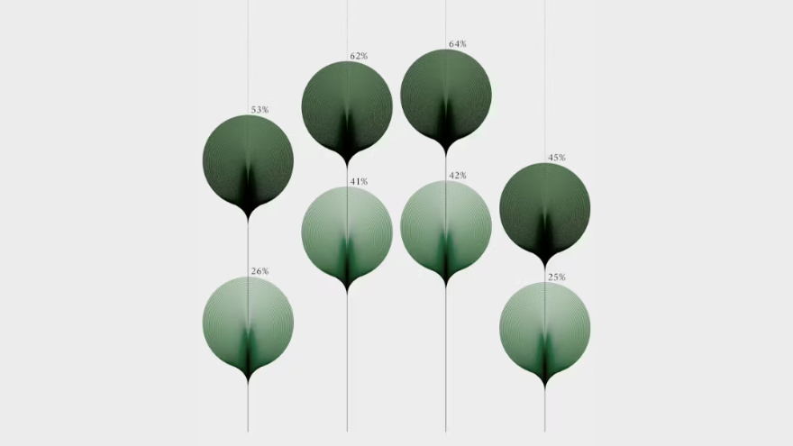
Italian information designer Federica Fragapane’s latest installation, Shapes of Inequalities, redefines how we perceive data. Displayed at the 24th Triennale Milano under the central theme of “Inequalities,” the series features 16 abstract visualizations across ten critical dimensions—from economic disparity and healthcare access to gender bias, climate to displacement.
In Shapes of Inequalities, data is more than numbers—it becomes a lens through which viewers perceive the world’s most pressing social disparities. The series of data visualisations challenges the myth of neutrality in both data and design. Each visual is the result of a deeply considered process, one that acknowledges the layered, subjective nature of interpretation.
Rather than flattening complex realities into charts and graphs, the installation gives form to the hidden contours of inequality— the shapes are not rigid or purely analytical; they are expressive and organic, signalling the human presence embedded in every dataset.
Fragapane embraces a soft visual language that contrasts with the often clinical tone of infographics. Her forms flow like petals or waves—embodying the lived experiences that data alone can’t convey. In doing so, she offers a new visual grammar for social justice: one that carries the weight of the facts but also the pulse of those affected.


