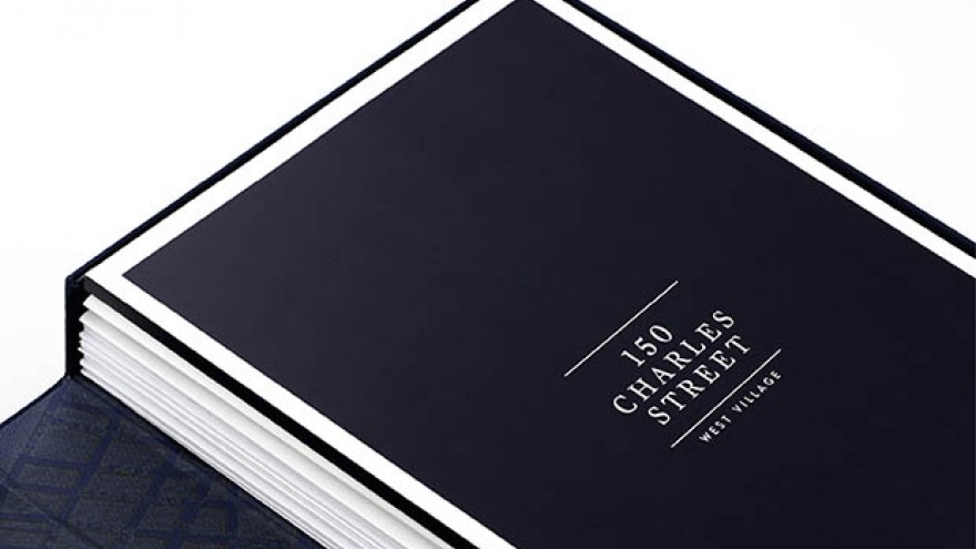
Michael Bierut’s identity for 150 Charles Street exudes elegance and luxury, thanks to its simple yet striking graphic motif.
As New York’s luxury real estate market continues to boom with no signs of slowing down, Bierut has highlighted how desirable residential units are with his brand identity and marketing materials for 150 Charles Street.
Located in the Far West Village of New York, 150 Charles Street combines the historic charm of the neighbourhood with state-of-the-art architecture. The identity and marketing for the project were designed to support an image of understated elegance.
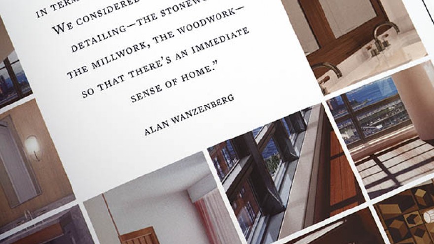
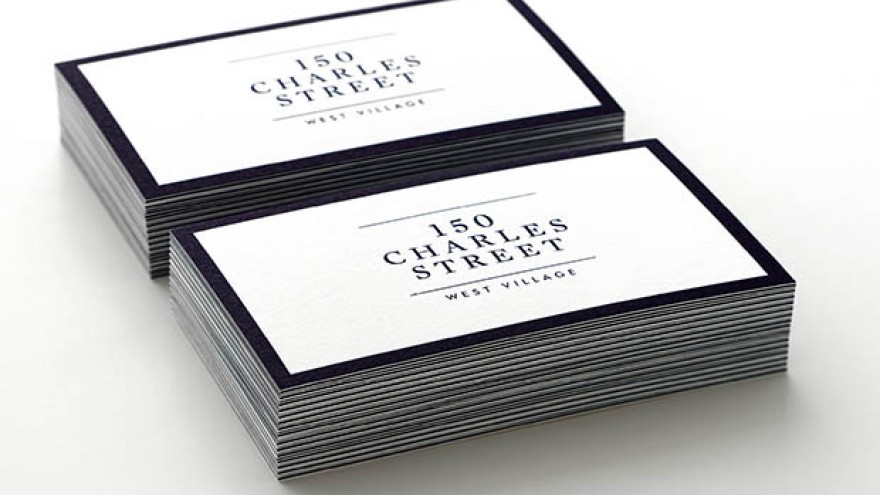
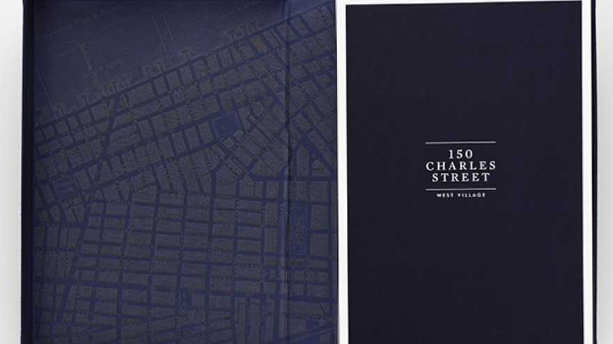
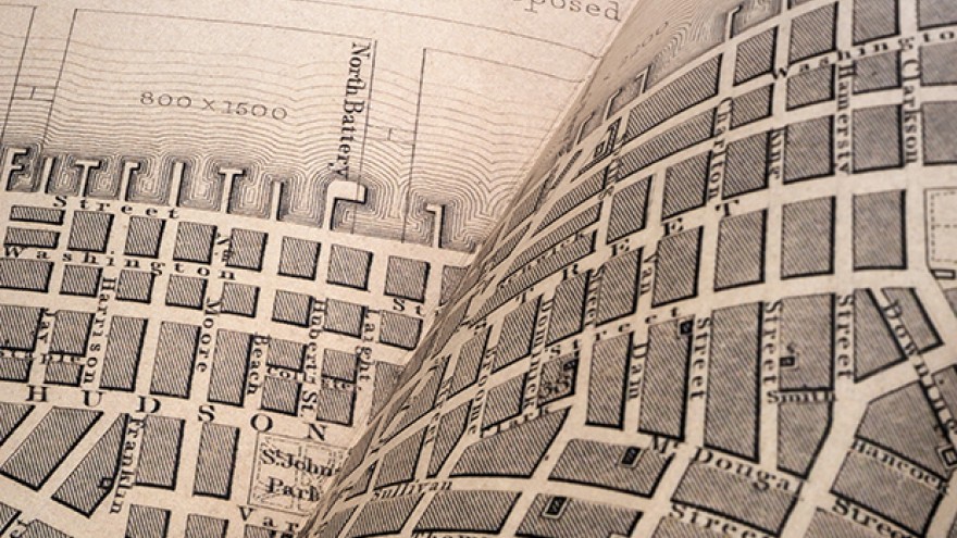
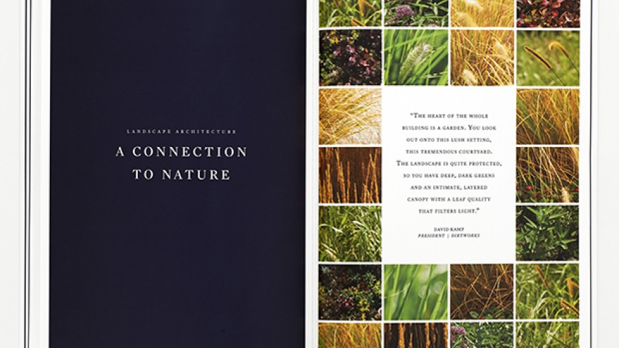
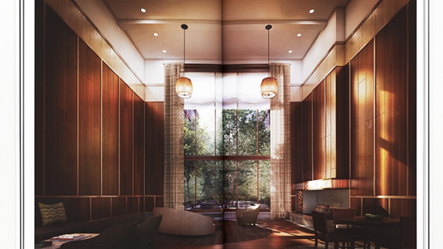
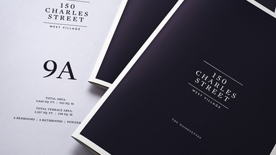
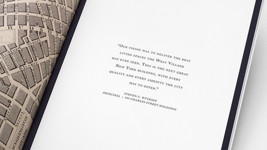
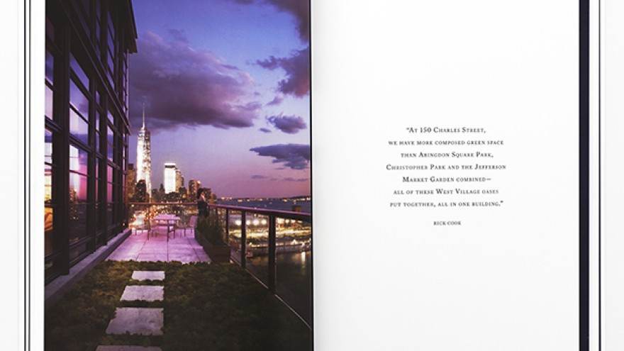
The branding uses a graphic motif inspired by the distinctive grid of windows in 150 Charles Street’s façade. The logo has the same proportion as the frames of the windows, and the project’s brochures, website and other collateral all feature a characteristic border. In the sales book, various versions of the development and photographs of the neighbourhood alternate with pages of details. End pages fold out to reveal a historic map of the area.
The identity is set in Mercury Display, with Futura as the secondary typeface.

