The entertainment designer

Multidisciplinary designer Emily Oberman has a formidable portfolio of work. We have a look at some of the campaigns she championed.

Emily Oberman's talents in branding span many platforms and mediums, but she is best known for her work in entertainment and hospitality. In 2012, the multidisciplinary designer joined Pentagram, the world's largest design consultancy. Before that, Oberman was at design agency Number Seventeen, which she cofounded, for seventeen years. From television shows to outside advertising campaigns and even a fictional drug for Hollywood, we have a look at some of Emily Oberman's recent work.


Saturday Night Live’s 40th Anniversary Season

Oberman was no stranger to Saturday Night Live when she was asked to do the title sequence and new identity for the 40th anniversary season. Claiming to have seen every episode ever made, she had already worked on the 25th and 35th anniversaries while at Number Seventeen. The show is a New York institution and Oberman sought to find a way of blending the history of the sketch comedy show with the ever-changing face of the city. The new identity nods to the early days of the show – with its flickering, analogue graphics – but continues to develop its unique look and feel. The show’s 40th anniversary edition sequence forms a love letter to New York City.

Jigsaw

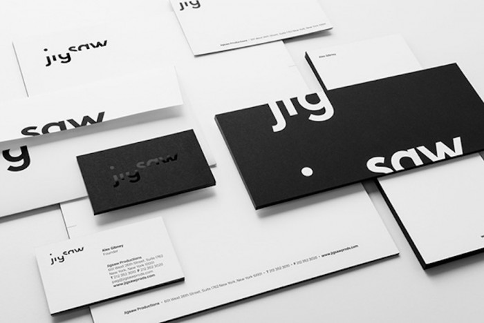
Oberman created a strong new identity for Jigsaw, the production company of the Academy Award-winning documentary filmmaker Alex Gibney. The new Jigsaw look used forceful typography that communicates its director’s fair but uncompromising style. Using only black and white, the Jigsaw logo has a journalistic feel. It is confident and sophisticated, much like the documentaries themselves. The cropped lettering puts the viewer in the same position as the audience for his films – that of filling in the suggested blanks. The two halves of the logo represent the balance in different points of view. Oberman won a Type Directors Club 60 award for her work on the Jigsaw identity.

Ablixa

In one of the more unusual campaigns that Oberman has been involved in, she created an identity for a fictional anti-depressant drug called Ablixa. The drug is at the centre of the film “Side Effects”, starring Jude Law, Channing Tatum and Catherine Zeta-Jones. The branding for Ablixa in the film had to be convincing and Oberman went about creating a story for it that parodies pharmaceutical products, using an assortment of clichés and optimistic messages of recovery. Oberman chose to use a happy human mascot with pill shapes forming a sunshine-halo, and Futura Bold Italic font for the logo. Ablixa is the only “pharmaceutical” Oberman has worked on to date.

Montague Street

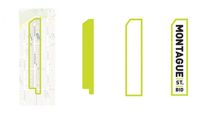
Montague Street is in the heart of Brooklyn’s downtown. It is an important commercial corridor lined with shops, eateries and a range of service-oriented businesses. The Montague Street Business Improvement District commissioned Oberman and her team to develop a new identity for the street that would make it a fantastic place to work, live and shop. Oberman, who had been living on the street for eight years at the time, created a striking identity lifted from the shape of the district itself that cleverly slots in to one side of the letter “M”. The identity also resembles a street sign.

Alphabet of Nations

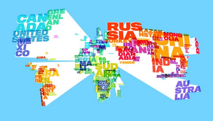
Brooklyn band They Might Be Giants (made up of duo John Flansburgh and John Linnell) wrote a song to help kids learn geography. It runs through countries of the world using the alphabet. To celebrate the 10th anniversary of their first children’s album “No!”, they collaborated with Oberman to create a delightful new video for the song using images sourced from fans around the world. They Might Be Giants often use technology in a playful way and Oberman used lively comic book-style letters (that zoom out at the viewer) and amusing stills of the band members. The video for the song takes you on a brightly coloured tour of the world, through the images and portraits submitted by the band’s fans on social media.

Do The Green Thing

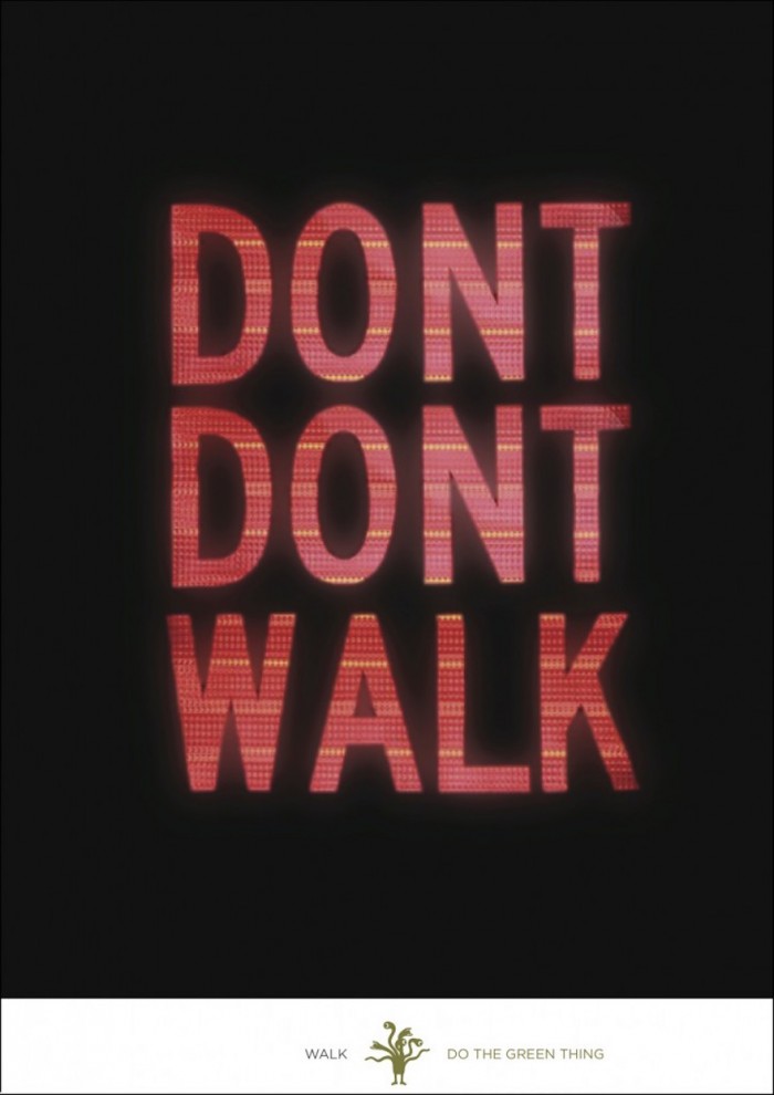
Do The Green Thing is an organisation that uses creativity to combat climate change. Many of Pentagram’s talented designers created posters for Do The Green Thing’s five-year anniversary. Here is Oberman’s witty contribution.

TD Five Boro Bike Tour and Expo

Oberman and her team at Pentagram designed the graphics for the 2014 TD Five Boro Bike Tour and the promotional campaign for the Bike Expo New York. The aim was to help the organisation connect with New York’s huge network of bicyclists. The campaign material was immediate and powerful, drawing on moments of the ride itself to bring the experience to life with taglines that described the spirit of the ride. The imagery showing the city pavements tied the campaign inextricably to the New York streets.

The Tonight Show Starring Jimmy Fallon

When Jimmy Fallon took over the host’s chair on The Tonight Show, television network NBC sought out Oberman to design the new identity for the series. Oberman took the crescent moon logo, present as part of the look of the show for most of the programme’s long history, and made the moon full to demonstrate the fresh approach Fallon would bring to the show. The moon was also moved to the centre of the logo, holding the name of the show in its globe. The clean, circular logo can be used in a variety of ways.

Watch the Talk with Emily Oberman