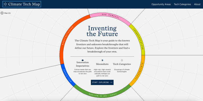

The new Climate Tech Map by Pentagram, led by Giorgia Lupi, created as a coalition-led initiative, attempts to chart the sprawling and rapidly evolving ecosystem of technologies shaping the future of climate action. Described as “Part taxonomy, part market map, part North Star toward a better climate future, the project transforms more than 2,000 climate technologies into an accessible, navigable universe.
Rather than presenting climate innovation as a flat database or sterile taxonomy, Lupi’s team approached the challenge as an exercise in orientation. How do you help people understand not just what technologies exist but how they connect, where the opportunities lie and what futures they imply? The answer is a richly layered digital experience that feels less like browsing a website and more like navigating a celestial map.
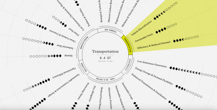
At the centre of the platform is an interactive “wheel”, a radial interface divided into six major sectors and twenty-four “Opportunity Areas.” Inspired by astronomical charts, the space race and the optimism of exploration, the system evokes both scientific precision and imaginative possibility. The project also signals a broader evolution in the role of designers working with data. Increasingly, information design is no longer about simplification alone. It is about creating systems that support curiosity, participation and long-term understanding. In this sense, the Climate Tech Map behaves less like an infographic and more like civic infrastructure.


