
From the Series

The past decade has seen some dramatic changes in the music industry but Billboard magazine, the industry’s so-called trade Bible, has managed to hold its own despite much ebb and flow.
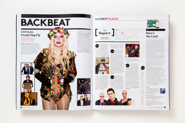
Recently Michael Bierut and his team at Pentagram New York redesigned the magazine’s graphic identity in a way that makes Billboard’s in-depth information more accessible and engaging.
“Billboard has a more central role in pop culture than any mere trade magazine. It’s an American icon, like the Coke bottle,” says Bierut.
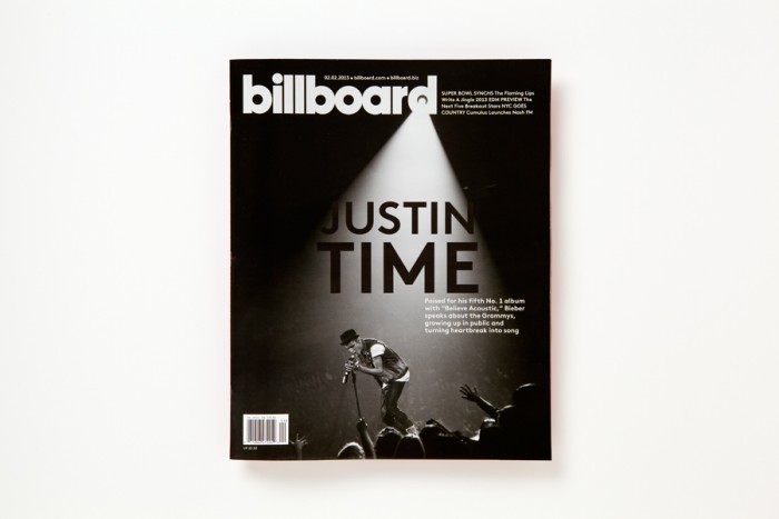
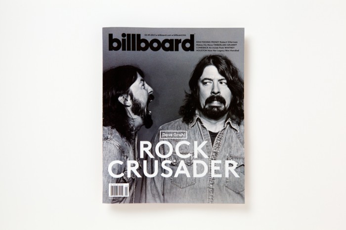
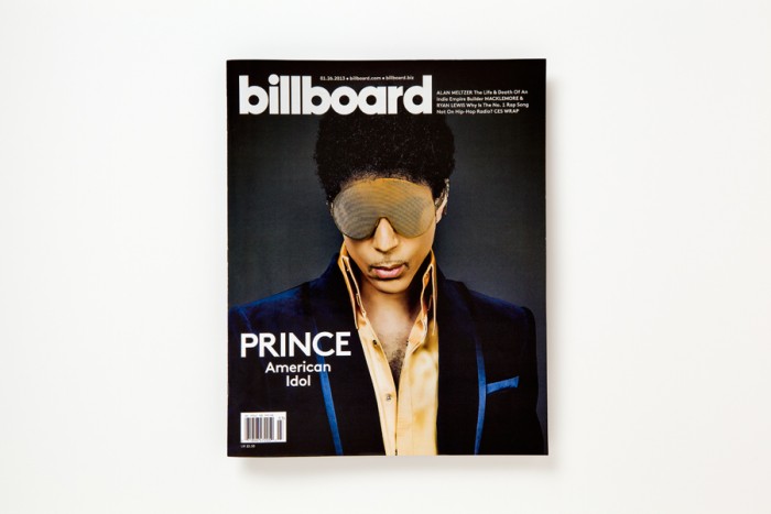
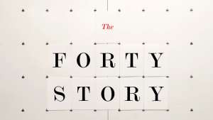
Refreshing and redrawing the logo to emphasise the basic geometry of the name went with the creation of a new typeface that resembles the original circles and still says “pop”.
Other important features included:
- Setting the name entirely in lowercase, tightening the spacing and removing the colours from the circles
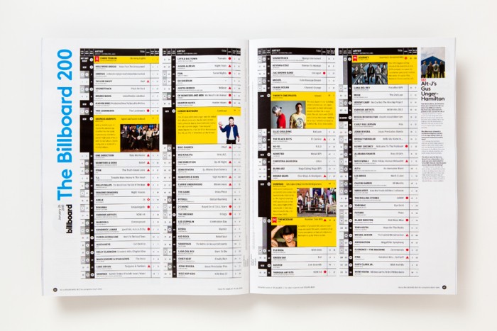
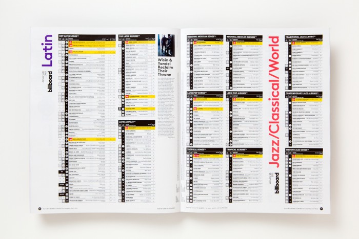
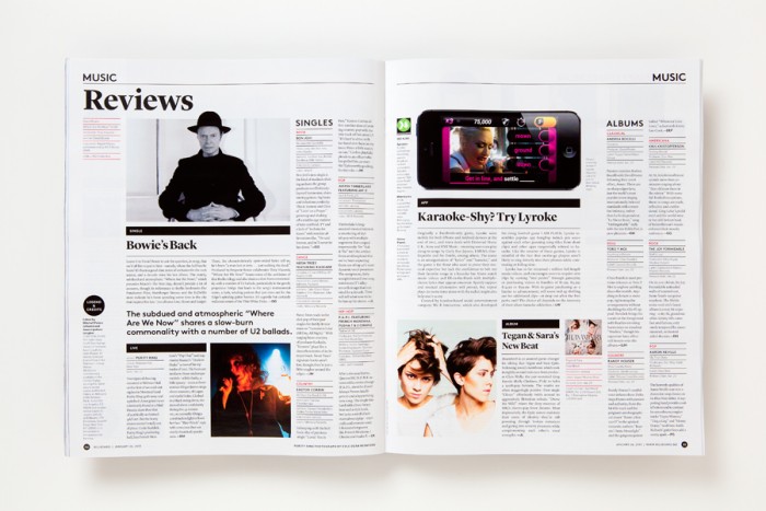
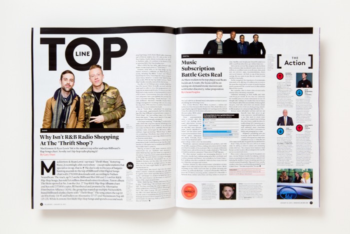
- The sections have been reorganised and restructured
- The table-of-contents has been renamed Viewpoint and features quotes from the week’s best stories
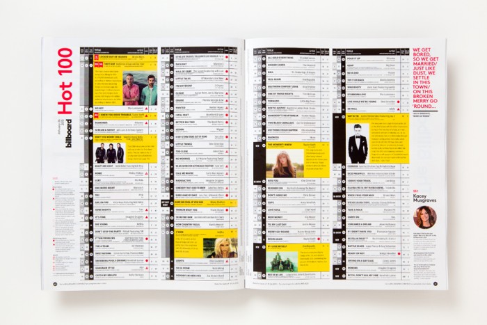
- Headers are paired with graphic bars inspired by charts
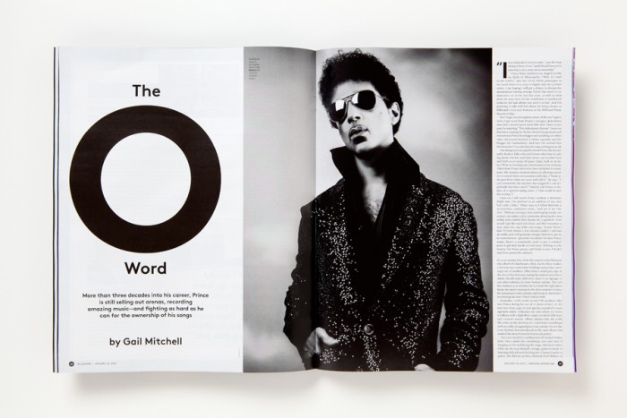
- Page layouts are opened up with graphs, pull quotes and other data in the margins
- The design uses different typeface in a complementary way, including LL Brown, Lyon Display, Atlas Grotesk for headers; Lyon Text for body copy; and Ziggurat for special features and advertorials
Ensuring the magazine’s charts are easily understood was one of the biggest design challenges. “For me, helping to redesign the Billboard charts was the ultimate information design challenge,” says Bierut.
Read more about the details of the redesign here.
An iPad version of the magazine was also designed and recently launched.
Watch the Trailer with Michael Bierut