From the Series
Abbott Miller celebrates the diversity of typefaces and their integral role in design over the past century.
Pentagram’s Miller has designed the layout for Century: 100 Years of Type and Design showcased at the AIGA National Design Centre in New York City. The exhibition seeks to commemorate the various forms of type that surrounds us everyday in countless shapes and forms.
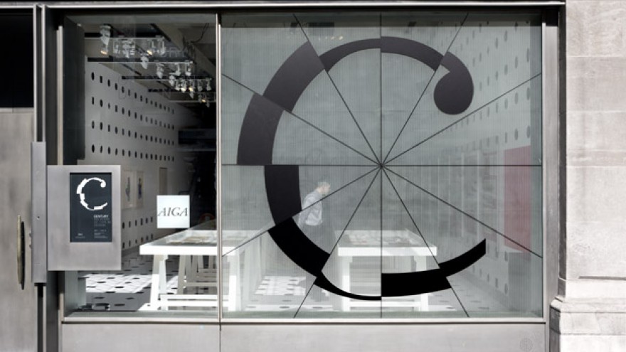
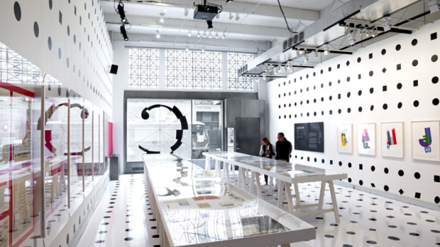
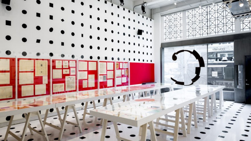
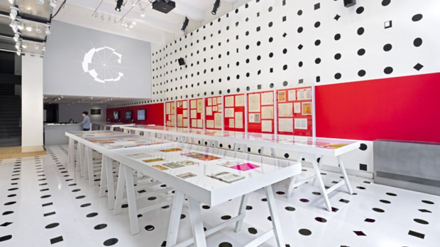
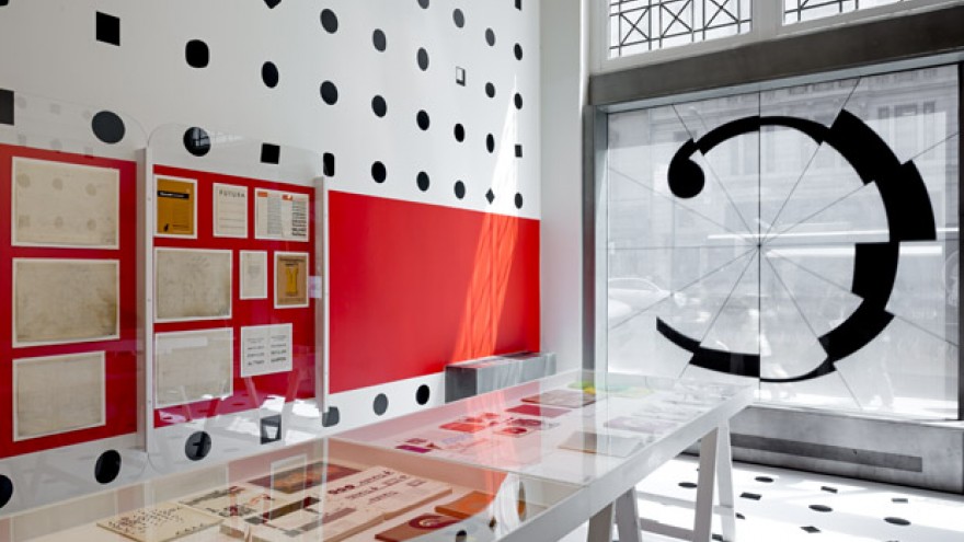
Miller’s layout design transforms the AIGA gallery into an immersive environment of typography. The walls and ceilings are dotted with 1 058 shapes drawn from different typographic periods, which sees 630 typefaces taken from the gallery’s library and archives. Displayed in the gallery window, the core identity of the exhibition is a letter C rendered in segments of different fonts.
Miller further designed two animations to accompany his identity design. The first one, titled “Fractured Century”, cycles through hundreds of typefaces that move like the minute hand on a clock. Each rotation has 12 font fragments and in the five-minute animation approximately 600 different fragments are revealed.
The second animation, “Full Stop” identifies all of the typographic periods displayed on the walls and ceiling. Set to the pulsing sound of a heartbeat, the animation hints at the notion of type being at the heart of all graphic design.
Lastly, exhibition artefacts are showcased in cases and on the walls to represent the evolution from typeface conception to demonstrations of fonts in use. These include typeface production drawings by leading designers of the last 100 years, proofs, type posters, advertising and packaging.
Century: 100 Years of Type and Design is free and open to the public until 18 June 2014.

