First Published in
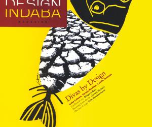


Luba Lukova from New York, Teresa Roviras from London, Lucille Tenazas from San Francisco. Three celebrated contemporary designers, illustrators and artists whose individual portfolios are inspired, relevant and instantly recognisable. All critically acclaimed and widely published, Lukova, Roviras and Tenazas each delivered deeply personal lectures at the 5th International Design Indaba®. They shared their experiences and explored their motivations in terms of the their individual creative process. The next few pages are an exposé of their work, together with excerpts from their lectures. As divas, theirs truly is "design in the service of communication".
Luba Lukova
"Simplify. And say something"
New York-based, Bulgarian-born Luba Lukova has won numerous awards for her poster designs, including HOW Magazine's International Design Competition Best of Show for "The Taming of the Shrew," and Honor Laureate at the International Invitational Poster Exhibition in Fort Collins, Colorado. The title of her lecture at the 5th International Design Indaba®, "Simplify. And say something", lives at the heart of each of her creations. "I want to be able to speak with very little," says Lukova, "but be able to move people."
The poster, Sudan, is one of a myriad images that exemplifies this approach. Commissioned by a New York group, it raises awareness of the issue of poverty in Sudan. In this stark black and white image, an emaciated human face is pictured with open mouth. Within the mouth, we see a nutritional food label that indicates all nutrients are zero.
Says Lukova: "Sudan speaks about the contrast between the West, where we are concerned with low calories and losing weight; and other parts of the world where people don't have anything to eat at all."
Widely recognised as an artist of conscience, Lukova is adamant that "design is an art form that brings awareness to society". The idea is that the posters deliver messages that are "keys that go from mind to mind, disseminating the human experience," explains Lukova.
Whatever the message, whatever the medium, Lukova's designs are refreshing. Bold graphics, humanistic illustrations, limited colour - often a single ink on coloured paper - and hand-lettered typography are hallmarks of Lukova's work and create a graphic style that is elegant yet extremely powerful.
"Working with so little is very difficult," explains Lukova, "but posters that are simply executed are more effective and very powerful." And it is this, the combination of simplicity and raw energy, that give her work its incomparable and essential place in the world.
Lucille Tenazas
Vital Curriculum
Lucille Tenazas is the principal of San Francisco-based Tenazas Design, a communication graphics and design firm. Her work, published internationally, reflects a deep interest in the complexity of language and the overlapping relationship of meaning, form and content. "I am interested in involving meaning through mental associations that are not immediate, but are arrived at over time and are more profound that the initial reading: a verbal wordplay that is open to interpretation," says Tenazas.
An outstanding feature of Tenazas's work is her exploration of typography as a language, and the analytical process of dissecting that language. Born and educated in the Philippines, Tenazas learned English as a second, written language. It was only when she moved to the United States in 1979 to further her studies at the California College of Arts and Crafts (CAAC) that she began to explore the nuances of English as a spoken language. It is this eclectic heritage that has manifested itself in her practice as a graphic designer. "I started to see words as objects with a physicality that can be held and touched," explains Tenazas. "I seek to empower their meaning." Her typographical and grammatical explorations draw the viewer's attention to the very letters of which those words are made, and parts of words or sentences often float freely on a page, giving a playful meaning to their message.
Her 5th International Design Indaba® lecture, "Vital Curriculum," encapsulates the ideas, philosophy and curriculum that Lucille Tenazas has developed as a teacher for the past 15 years. It explicitly describes a process that deals with "personal voice" or authorship within the discipline of graphic design. It discusses the role of the designer as author by "giving meaning to content that didn't exist before". Tenazas balks at the idea of the designer residing quietly in the background, leaving content undisturbed. So strong is her belief that her MFA students at CAAC are required to take a creative writing course as part of their art degree.
As a final note in her lecture,Tenazas acknowledged the importance of her students to her own work and the impact they have had. Her reciprocal goal is to help her students develop points of view shaped by their own personal histories, in much the same way her own journey has.
Teresa Roviras
Walk down any high street in the shopping capitals of the world and you'll recognise Teresa Roviras's work. It's inevitably hanging from an elegant string, containing someone's newly purchased clothing. This is her passion - her shopping bags - for Joseph, Gigi. Connolly Luxury Goods, Designers Guild, The Holding Company, The Scotch House - the definitive symbol of her work: the quest for the simplest design solution possible.
"I used to think I had a very lazy brain," said Roviras at the 5th International Design Indaba® lecture. "I only came up with really simple ideas; what I felt was maybe too simple. But as I tried to find the easiest way out, that action enabled me to self-edit, which ultimately resulted in stronger design solutions. By removing the excess, I end up with the minimum elements that I need to communicate. After that, it's simply a matter of composing these to create the most impact."
"Less is more" is the hallmark of Roviras's work. From the Cinnamon Bar packaging to the corporate identity for the Clarence Hotel, Dublin, to the packaging for 'Joseph Parfum du Jour' (for which she won a D&AD Silver in 1998), it is exquisitely honest design, communicating with single-minded depth and clarity that cuts straight through the noise of modern life.
As Roviras explains: "Not everything simple is beautiful. But often the most beautiful things are the simplest."