They might describe their work as “scavenging the ruins of Modernism” but Experimental Jetset’s graphic design output is neither dated nor derivative. It is simply conscious of its origins and place in design history. The Dutch studio’s members – Danny van den Dungen, Erwin Brinkers and Marieke Stolk – see their work as an archive of influences harvested mainly from the era of Modernism.
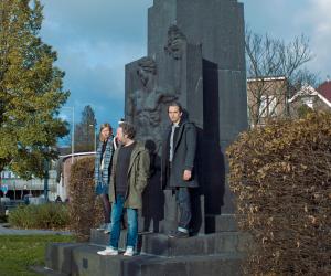
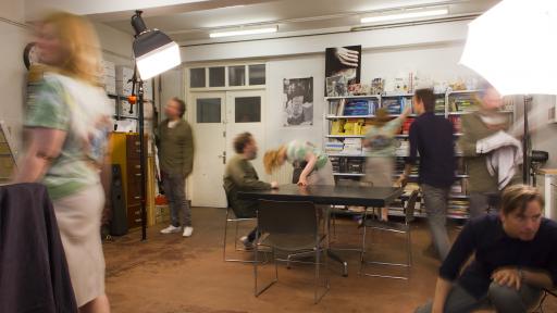
The trio have worked together since 1997 after meeting as students at Gerrit Rietveld Academy in Amsterdam. They focus on a wide variety of projects, mainly printed matter and site-specific installations.
In this presentation from Design Indaba Conference 2014, they trace their career as an “alphabet” of influences, from A to Z, showing inspirational ideas, people or movements alongside examples of their own produced work.
a = day of anarchy
An iconic poster by Dutch cartoon artist Bernard Willem Holtrop with a reversed lower case “A” inspired the trio for its “sharp and clear design but contrarian element,” says Marieke Stolk. Simple and seemingly benign, the poster’s back-to-front A represents “the contrarian nature of printed matter – the idea that you need something negative to get something positive”. The studio’s poster for a group exhibition called Anarchitecture, designed in 1999, uses a similar device: it flips the show’s title upside-down, using type to encapsulate the subject of the exhibition.
b = the beatles
Experimental Jetset have always been fascinated with the relationship between pop culture and the avant-garde – exemplified, for example, by the record sleeve of The Beatles’ White Album designed by pop artist Richard Hamilton in 1968. “It’s basically a piece of minimalist art, embossed and numbered, suggesting a limited-edition,” says Erwin Brinkers. “But then this multiple is blown up and becomes a mass-produced album injected into the mainstream.”
It’s quite a dangerous game, but one we find extremely interesting.
A print the group designed in 2001 for a Japanese T-shirt label is similar in more ways than one. It is emblazoned with the words “John&Paul&Ringo&George” broken up over four lines. It became a huge hit – “our 15 minutes of pop culture fame”.
“Our idea was to come up with an archetypical rock shirt abstracting the image of the band into a factual list of names,” Brinkers says. “It was meant as a conceptual gesture but made its way into the mainstream, and spawned hundreds, if not thousands, of copies and variations.”
c = wim crouwel
The three designers’ shared heritage growing up in what they call a late Modernist, socially democratic environment in the Netherlands laid the foundation for their work. They owe a huge debt to Dutch graphic designers such as Wim Crouwel. “We consider this late Modernist language almost as a kind of mother tongue, maybe even a sort of folk art,” says Danny van den Dungen. “We now feel entitled to use it, to expand it, to explore it, to tell our own stories with it...”
Influential thinkers and visual disruptors
The group cite multiple other creative thinkers and revolutionaries who have influenced their work.
French Marxist theorist Guy Debord’s concept of urban geography encouraged them to imagine their work in an urban environment – something reflected in their map design for the Whitney Museum of Art in New York City.
Italian artist Lucio Fontana, who died in 1968 and was known for slashing and puncturing his canvases, inspired them to reveal the material dimension of the printed object. Fontana’s work can be seen as a destructive gesture but for them, it is a constructive one: “It is showing painting as the material object that it really is,” says Brinkers. “Throughout our practice we have always attempted to achieve something similar. Through the cutting, folding and perforating of paper we try to show the construction of the printed object.” This can be seen in a monthly programme poster they designed in 1996 for an Amsterdam music venue, which is still being used today.
Another great influence is French film director Jean-Luc Godard, whose famous quote sums up Experimental Jetset’s approach: “What interests me is not the representation of reality – but the reality of representation.”
We are uncomfortable with the notion of reproducing reality; we want our work to become a part of reality, not an imitation of it.
“At the same time we fully realise that the practice of graphic design has a lot to do with representation and reproduction, so we cannot really avoid it,” notes van den Dungen.
Whenever possible, they try to include little clues about the nature of reproduction in their work. “We try to make the viewer aware of the reality of representation by revealing the methods of reproduction and of printing,” he says. “In our case we try that in subtle ways by overprinting layers on top of each other. The designer can break the spell of the image and keep the viewer aware that he/she is looking at an object that is printed.”
The group acknowledge the deep impact of filmmaker Stanley Kubrick’s work, too – his “stylised existential terror, a relentless merciless aesthetic”. Though they admit his famous perfectionism is hard to live up to, they share an obsession with details and a “neurotic desire to control even the smallest elements in our work for better or for worse”.
A conceptual piece by the American artist Sol Lewitt that consisted of a set of step-by-step instructions for creating his artwork gave them the idea for how to communicate their graphic identity for the Whitney Museum, which uses endlessly varying angles of the letter “W” to fit different contexts.
The sway of sub-cultures
One of Experimental Jetset’s main inspirations was punk rock even though, as the trio says, they were too young to be involved in the original punk movement of 1977. “But as teenagers in the 1980s we were involved in post-punk sub-cultures such as New Wave, Psychobilly, 2 Tone and Mod,” notes Brinkers.
Their design of the Whitney’s new identity was informed by the No Wave post-punk sub-culture that sprung up in New York City in the late 1970s and early 80s. “Since it is one of the prisms through which we view New York City, it was only logical that some of the language of No Wave would make its way into the Whitney project,” says van den Dungen.
There is a certain self-conscious, awkward quality in the Whitney identity that can be traced back to the nervous angular rhythms of No Wave.
Other influences they cite are experimental visual or concrete poetry, which calls attention to language’s material appearance on the page, and the Dutch anarchist movement Provo, which “forever shaped Dutch political landscape”.
On Helvetica
The group have become synonymous with the use of Helvetica typeface in the graphic design community, which they humorously acknowledge has become a cross to bear. “We actually hate Helvetica,” says Stolk.
They refuse to see it as something that defines their work. “”If anything we see it as more of a natural tone of voice as part of our everyday vocabulary. We are not the sort of actors who speak in a different voice or put on another mask everytime we play another role,” she explains.
She acknowledges that they probably have themselves to blame as they were included in Gary Hustwit’s documentary about the much-used, love-it-or-hate-it font. “We basically signed our own death sentence – in Helvetica obviously!”
A personal relationship to Modernism
If there is one consistent theme in Experimental Jetset’s work it is a personal relationship to Modernism. But they offer this caveat: “We have to admit that we have a very broad definition of Modernism. In fact, we usually speak of Modernisms,” says Stolk.
The notion of one single unified idea of Modernism is a misnomer. “In our view Modernism consists of a multitude of often conflicting Modernisms,” she says. “What binds them together is that they can all be seen as a set of specific reactions to Modernity.”

