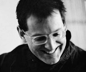
Harry Pearce has designed a new identity for the Crouch End Festival Chorus that expresses its European outlook and a global reputation.
Crouch End is not only a small suburb in the North of London, it’s the home of the Crouch End Festival Chorus, one of Britain’s major symphonic choirs, regular voices for Doctor Who soundtracks and frequent performers at the acclaimed Royal Albert Hall.
For the chorus’ new visual identity, Pentagram’s Pearce used descriptive typography building out from the logotype to represent the swell of music. The typography changes colour to guide the eye and allude to the textural changes in music.
'From the heart, at the heart' is the philosophy we based the graphic approach on. It came from the realisation of the sheer passion in the choir’s performances and their belief in being at the centre of music, says Pearce.
Beneath the typography of leaflets and posters are abstract images that reflect the feeling of the central theme of a specific performance.