What is timeless design? The Oxford English Dictionary defines ‘timeless’ as ‘not affected by the passage of time or changes in fashion’. The phrase is generally used to mean elegant: pleasingly graceful and stylish in appearance or manner. I’d add the words iconic, neat, beautiful, refined and effortless.
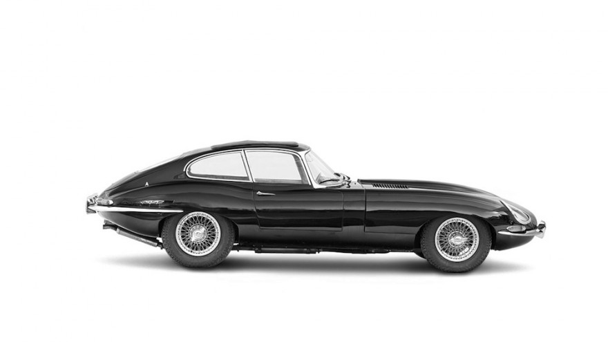
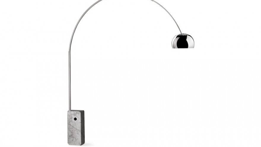
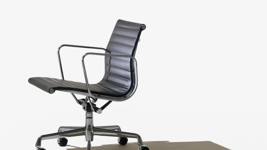
For me, we’re talking about the Arco lamp, the Jaguar E-type, the NY Subway signage system, the V&A logo, the Eames aluminium task chair; as ‘design classics’ they are “outstanding examples of lasting worth and inherent value”. They have been given meaning through a thoughtful and rigorous design process. As designer Massimo Vignelli puts it, they are “intellectually elegant” as opposed to ‘fashionably elegant’.
But, when these timeless designs were created, when they first appeared in public, they weren’t immediately ‘timeless’. Time – to form opinions, to contextualise, to discuss, to frame, to question and eventually come to love the designs – had to pass before they earned the title ‘timeless’.
So how are timeless things created? I’ve always believed that simplicity is the key to good design. To endure, to ‘stand the test of time’ a design has to appear simple. And to achieve this simplicity the designer needs time at their disposal: time to think, time to experiment, time to reduce, reappraise and refine. Good design requires hours, days, months.
It’s a contradiction. Effortless design requires effort. Graceful design takes blood, sweat and tears.
Another contradiction: Let’s not forget that when the objects and logos I describe above were created they were not meant to be ‘timeless’. They were created as modern, cutting edge, a vision of the future. They were in many cases original, bold and daring, they were ‘against the grain’.
Time does not stand still, in fact, as I picture it, time travels right to left on a linear timeline. So anything that stays still, unmoving, is really going backwards. Everything is affected by the passage of time, and there is no escape (yet).
The first Stratocaster came off the Fender production line in 1954 and has remained for the best part unchanged for 60 years. A new Stratocaster looks much like the original – just shinier, untouched by the patina of time. In reality, everything about that guitar has been tweaked, improved and adapted; from the choice of varnish, the profile of the neck, to the technology under the pick-guard (and the type and number of screws used to secure it). It’s a classic. It’s timeless. When it was born it looked like it had landed from outer space.
The same goes for visual identity. Since 1886 the Coca Cola brand identity has been a shifting and evolving beast, some elements have remained relatively constant, the colour red, the script logo, but in essence it has moved with the times. What works well on a tin can doesn’t necessarily work well on social media. You have to move with the times (or indeed, if you agree with my timeline analogy, you need to move in the opposite direction).
So, even the things we believe are the same as they always have been are in some way evolved or changed to accommodate outside influence, be they health and safety legislation, legal complications or marketing fads. This is not about being inauthentic or unfaithful to the original, it’s about good business sense. What the iconic designs I mention above have in common is the fact that the evolutions that occur over time have not overcomplicated or compromised them. They have retained their elegance, their simplicity, when perhaps others haven’t. So the real test of timelessness… is time itself.
This article was written by Nick Finney, founder and creative director of NB Studio branding and creative agency. It was first published on the NB Studio blog. Follow them on Twitter at @nick_finney and @NBStudio.


