Designer and inventor Kosuke Takahashi is naturally shy by nature. But his way of overcoming this shyness is to find ways of communicating and connecting through his designs. He endeavours to create universal communication tools that have positive impact, especially ones that create new links between divergent groups.
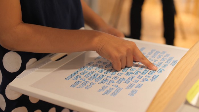
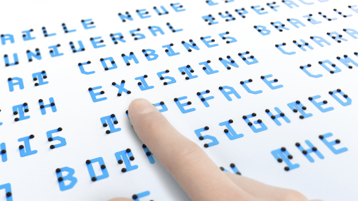
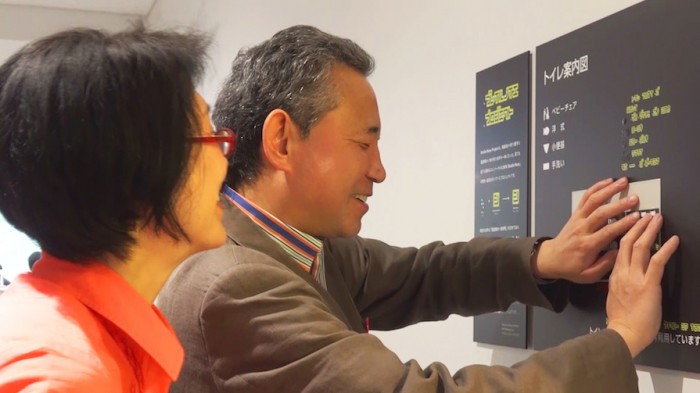
His typeface, named Braille Neue, works around the shapes of the Braille characters to add the corresponding Latin letters so that both visually impaired and sighted people can read from the same page.
“The biggest inspiration was the words my blind friend said: ‘If you can read braille, you can read books in the dark’,” explained Takahashi. “His perspective made me aware of the untapped potential and the future of communication tools.”
As well as being universally accessible, Braille Neue creates opportunities for conversation and connection where they might have been lacking.
“My design ethic is ‘not to be exclusive’. I believe that the connection between people who were previously unconnected makes the world better.”
Takahashi then noticed how infrequently Braille is used in public spaces, because it would normally have required space for a second sign and is not considered a priority. His typeface solves this problem by removing for both by combining the two languages, ensuring that information can be accessed by anyone.
Tokyo-based Takahashi has already won several awards for his typeface, and Braille Neue is going to be used throughout the communications material for the Tokyo Olympics and Paralympics, now scheduled for Summer 2021. Braille Neue consists of two typesets: Braille Neue Standard for English language, and Braille Neue Outline for Japanese and English.
Takahashi has been chosen as one of 10 selected Global Graduates who will present their ground-breaking work at antenna 2020 as part of Dutch Design Week. We had the chance to chat with this young designer about his project, his design ideologies and why Helvetica is a great inspiration to him.
Design Indaba: What is your definition of design?
Kosuke Takahashi: Making new relationships between people who were previously unconnected.
What made you decide to study design?
When I was a high school student, I loved Sci-Fi movies and spacecrafts and was really interested in future technologies that enrich our lives. So, I intended to study astronautics and engineering at the university.
However, after taking a design class and making a high school movie and poster, I realised the fun and importance of appealing to people's hearts.
I thought that understanding engineering and having the ability to make an impression on people through design were both necessary. That's why I chose a university where I could study both.
What piece of design do you really look up to?
‘Helvetica’ designed by Max Miedinger and Eduard Hoffmann in 1957. I love the design system. I think it is very nice that this beautiful typeface is the basis of many design systems around the world.
I also named my typeface as a tribute to ‘Helvetica Neue’, which is an updated version of Helvetica, because ‘Braille Neue’ is an updated version of Braille. I want it also to become a typeface that will spread around the world.
Who would your dream client be?
Braille support is relatively advanced in public spaces, but I would like it to be used more casually. In that sense, I think a collaboration with fashion and sneaker brands would be great.
My blind friend said that clothing and shoe labels that can be touched would allow him more choice and enrich his life. I think that also becomes a trigger to understanding the world of the visually impaired.
It would also be great to work with fun things like toy companies.
How useful are constraints in the design process and what were your main constraints with this project?
Design constraints come from past conventions. But they can be useful to get more people to accept the design. The main constraint for ‘Braille Neue’ is the system of the Braille.
By exploiting the existing Braille rather than creating a completely new system for the visually impaired, I was able to make new communication tools more accessible to more people.
Do you think design is the result of individual inspiration or collective consciousness?
Both. All the ideas come from the result of collective influence from designers and things that have gone before, but our individual curiosity helps design evolve. So, it's personal in the sense that its evolution wouldn't have happened without our individual curiosity and inspiration.
Should products always be ‘useful’?
Of course, usefulness and correctness are necessary, but I think that the intuitive and emotional aspect of any design are essential for solving problems.
People are attracted to things that intuitively feel good. Sometimes, intuitions like ‘fun’, ’beautiful’, and ‘humorous’ are beyond logic like ‘useful’ and ‘correctness’.