A few weeks back, Design Indaba was gearing up to flood South Africa with insight and inspiration across the whole gamut of creative disciplines.
Reporting live from Cape Town, we brought you:
- Lessons in brand design from Nike, Lego and Starbucks
- Joe Public's view on how design can make a difference
- Golden rules of branding according to G-Star RAW
- How better client relationships can improve your work, from Pentagram's Emily Oberman.
The best of South African design
Running alongside the conference, the Design Indaba Expo showcased the country's best output – from fashion and interiors to product design, illustration and more.
This included Paper Planes, a group exhibition by local illustration agency Alexander's Band that invited 22 illustrators to create an exclusive piece of artwork along the theme of South African mythology. Here are our seven favourites...
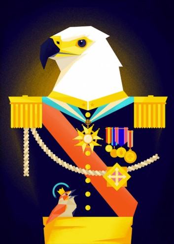
1. Adam Hill aka Velcrosuit
Adam Hill is a graphic designer, illustrator and musician based in Cape Town. He juggles his nights and days between his two passions – music and design, and likes lasagne, graphic novels and growing a beard.
Describe your style?
I love combining mid-century, abstract, gig poster and simplified styles with my love for texture and warmth.
How did you respond to the brief?
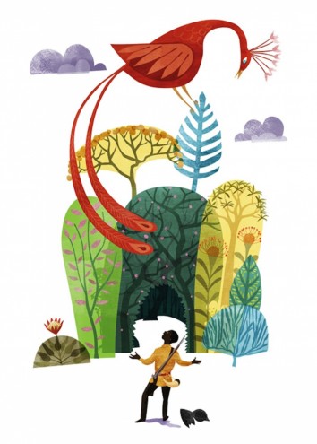
I was excited to illustrate a myth I last read when I was a kid, called 'How The Birds Chose Their King'. The idea for the illustration was actually a collaboration with my girlfriend.
My style offers me the chance to create something graphically bold, but also learn more about reduction and abstraction.
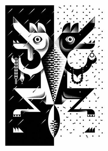
2. Jono Garrett
Johannesburg-born Jono Garrett spent six years in advertising before going freelance three years ago. He focuses on "communication design, with a bit of above-the-line and branding" – and manages to fit illustration in there too.
Describe your style?
Initially my style was dictated by whatever the job required, but lately I've been focusing on basic geometric forms. I was fascinated by Tony Hart as a kid, how he could make animals out of a couple of circles.
I'm also inspired by Cassandre's work, and perhaps a bit of African pattern inspiration thrown in for good measure.
How did you respond to the brief?
My story was about contrast; sunshine and rain, good and evil, love and hate. I wanted to show the two sides of the jackal character - how on one hand he could be so charming, but on the other, so ruthless. Black and white seemed a fitting palette.
3. Maaike Bakker
Based in Pretoria, Maaike Bakker is a freelance illustrator who particularly enjoys investigating 'bizarre' themes in her work.
Describe your style?
I prefer a more stylized approach, and tend to implement odd perspectives and enjoy playing with strange compositions. I like vibrant colours, too.
The themes that I explore tend to vary, but mostly include fictitious spaces and landscapes, as well as odd creatures.
How did you respond to the brief?
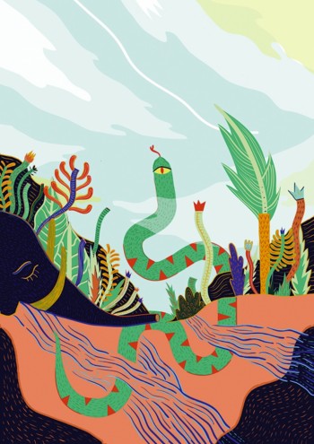
Despite my story having quite a sombre undertone, I tried to focus on the positive outcome which was that the snake (the protagonist) managed to provide its community with water and thereby revived the land.
The snake is depicted as the 'hero': the awkward perspective is introduced to reveal what is underneath, yet also show how it has influenced the improved condition of the land.
4. Rikus Ferreira
Rikus Ferreira is a graphic designer, illustrator and artist living and working in Cape Town. He has won numerous local and international awards, and has exhibited his work both locally and abroad. His work deals mainly with the art of the visual narrative.
Describe your style?
I would say my style is influenced by underground comics, especially French. Also South African landscapes and colours. I like to have an element of surrealism in my work too.
How did you respond to the brief?
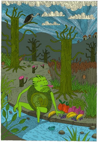
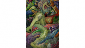
My story was about the tokoloshe - a smallish river creature that lures unsuspecting kids from the safety of their villages to the riverside. He uses fruits and other delicious foods as bait.
There are different takes on the story - some say he then eats the kids. Legend has it that you should put your bed on bricks to avoid the tokoloshe, because of his height he would then be unable to get you when you're sleeping.
5. Simone Hodgskiss aka Pearly Yon
After seven years in the advertising industry, Simone Hodgskiss took a leap of faith into the world of freelance design and illustration, working under the name Pearly Yon.
Describe your style?
I'd describe it as vector-based line work. I'm strongly influenced by the old and ornate, which comes through in the use of borders and patterns in my work.
How did you respond to the brief?
I took the gist of my story, which involved an elephant and a self-sacrificial snake, and made them the focus. I used the smaller details of the story in a symbolic way to create the borders and flesh out the story.
The elephant was meant to be a skeleton, but after illustrating it I realised an elephant skeleton isn't easily recognisable - it looked more like a walrus. So I changed it to a traditional elephant head.
6. Sonia Dearling aka Hirschling
Sonia Dearling grew up in Pretoria, and after studying communication design landed a job at top South African agency Shift Joe Public in Johannesburg. She enjoys yoga and consuming "vast amounts of peanut butter and cinnamon".
Describe your style?
It's still very much in development, but my work has been described as bold and tactile with a lot of emphasis on colour.
How did you respond to the brief?
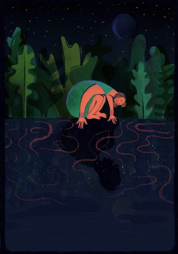
My illustration is inspired by a grim South African fable from 1856, in which Nonqawuse, a young Xhosa girl, sees strange faces looking up at her from the pool of Gxara.
The faces were the spirits of her ancestors. They whispered that they would help drive away the Europeans as long as the tribespeople promise to burn all their crops and slaughter all of heir cattle as a sign of good faith.
Nonqawuse's message caused a killing frenzy, resulting in starvation and mass death of the Xhosa tribe. Her name and the pool of Gxara still remain a curse for the Xhosa people.
7. Toby Newsome
After a brief spell in advertising, Cape Town-based Toby Newsome turned to freelancing, balancing illustration commissions with book jacket design. He loves interpreting text and distilling it into core visual images.
Describe your style?
Whimsical. An appreciation of the past: in terms of draughtsmanship but also older printing techniques, and production: misregistered printing plates interest me.
There's a feeling of collage with much of my work. I like working with loose shapes, patterns, and a delicate line.
How did you respond to the brief?
I read all the stories, and The Enchanted Forest was a clear favourite. I decided on a 'key' scene in the story, and did a few very quick sketches to determine a rough composition.
The final illustration is an organic process: building and collaging shapes and elements, and also involves trying to stay loose and spontaneous – I feel that's very important, especially when working digitally.
Nick Carson is the editor of Computer Arts magazine. You can read more about the Paper Planes exhibition.

